| Author | Thread |
Comments Made During the Challenge  |
|
|
05/13/2003 11:00:36 AM |
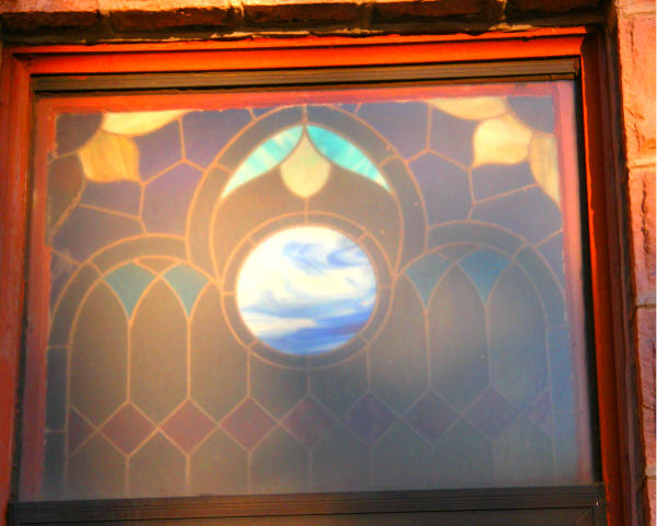
| This would have a lot more impact had you shot it square on and cropped it a little more evenly. I do like the idea you are trying to depict though. |
|
 Photographer found comment helpful. Photographer found comment helpful. |
|
|
05/12/2003 11:27:13 PM |
| Sorry, the off-framing just doesn't work. |
|
|
|
05/12/2003 09:50:35 PM |
| it looks a little light try to expose for just a little longer it would create more intrest to your picture. Nice Work |
|
|
|
05/12/2003 01:57:44 PM |
| If you were on the other side of this window it would score a hundred time better. |
|
|
|
05/12/2003 08:41:28 AM |
| Too washed out, or dirty. |
|
|
|
05/11/2003 11:23:21 PM |
| You should've centered or leveled this window, or both. The color quality is not very good and I'd have cropped out anything having to do with the bricks, or incuded them all around the window |
|
|
|
05/10/2003 08:21:18 PM |
| I think this is a good try, but the photo would be better if it were straight, the lighting better, and the focus sharper. I like the red of the window frame, and the colour of the bricks to the right hand side! |
|
|
|
05/10/2003 06:43:27 PM |
| This would have worked much better if you'd been on the other side of the window. Backlighting would have given better saturation to the glass. |
|
|
|
05/10/2003 02:40:12 PM |
| Interesting window. You might want to try and get the window head on because the symmetry is very important here. the tilted angle to the left takes away from that symmetry. - |
|
|
|
05/10/2003 02:03:42 PM |
| Looks a little hazy. Could you capture this when the light is better, maybe? :) |
|
|
|
05/10/2003 10:18:35 AM |
I like the smokey look of the colors. Squaring it up in the frame would improve it in my eyes.
Mark |
|
|
|
05/08/2003 06:46:35 PM |
I think this could have been a lovely shot, if you had done the following:
Taken the picture so that it was level. Cropped it so that there was only the barest hint of a frame from the window frame. Taken the shot when he light was different as it has washed out most of the colours (it might have been better on the inside of he house/church) |
|
| Photographer found comment helpful. |
|
|
05/08/2003 11:05:48 AM |
| Nice subject, but pic could use some improvement. Maybe you could have positioned yourself so your shadow wouldnot fall on the window panes. The light striking the window is washing out a lot of detail, different position might clear it up, and try to straighten up the whole frame. 4 |
|
| Photographer found comment helpful. |
|
|
05/07/2003 10:51:14 AM |
| The lighting/colors are a little muddy - otherwise this would have been a much better shot. |
|
|
|
05/07/2003 07:16:43 AM |
| The glass is a bit washed out by the sun - might have been great if taken from inside the building. |
|
Home -
Challenges -
Community -
League -
Photos -
Cameras -
Lenses -
Learn -
Help -
Terms of Use -
Privacy -
Top ^
DPChallenge, and website content and design, Copyright © 2001-2025 Challenging Technologies, LLC.
All digital photo copyrights belong to the photographers and may not be used without permission.
Current Server Time: 03/12/2025 07:04:39 PM EDT.