| Author | Thread |
Comments Made During the Challenge  |
|
|
05/13/2003 02:36:25 PM |
|
 Photographer found comment helpful. Photographer found comment helpful. |
|
|
05/13/2003 01:56:09 PM |
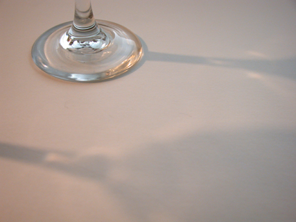
| if there was less negative space in the photo then it may look a little better. |
|
| Photographer found comment helpful. |
|
|
05/12/2003 09:48:16 PM |
| nice job on the shadows in the puicture and nice use of color |
|
| Photographer found comment helpful. |
|
|
05/11/2003 11:24:40 PM |
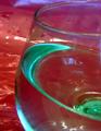
| i think if you had played with your white balance the light would look more pure. also, the shadows are a little soft, and i wonder if you needed to have the glass in the photo at all. |
|
| Photographer found comment helpful. |
|
|
05/10/2003 07:53:47 PM |
| Barely met the challenge, and I sort of get the feeling that the base of the glass is there so that it meets the challenge. I think you might have been better off taking the glasses from another angle, so that you got a lot more of them and their shadows. |
|
|
|
05/08/2003 04:44:37 PM |
| I like this a lot. There is not a element that "pops" but I am not sure how to do that, maybe some color or contrast? Good work - 8 |
|
| Photographer found comment helpful. |
|
|
05/08/2003 02:35:45 PM |
| Nice image. It is very clear and focused. I think however, that the shadows could be darker to add more value to the image. |
|
| Photographer found comment helpful. |
|
|
05/07/2003 05:49:17 PM |
| Intresting choice of composition -- if the shadows were darker, I think this would work a lot better. |
|
| Photographer found comment helpful. |
|
|
05/07/2003 02:37:28 PM |
|
|
|
05/07/2003 06:28:29 AM |
| Good minimalist idea, good crop. |
|
| Photographer found comment helpful. |
Home -
Challenges -
Community -
League -
Photos -
Cameras -
Lenses -
Learn -
Help -
Terms of Use -
Privacy -
Top ^
DPChallenge, and website content and design, Copyright © 2001-2025 Challenging Technologies, LLC.
All digital photo copyrights belong to the photographers and may not be used without permission.
Current Server Time: 03/12/2025 02:43:54 PM EDT.