| Author | Thread |
|
|
05/14/2003 04:10:43 PM |
|
 Photographer found comment helpful. Photographer found comment helpful. |
Comments Made During the Challenge  |
|
|
05/10/2003 12:39:41 AM |
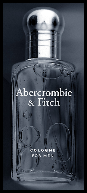
| Nice effect, esp on the lid area. The bubbles would indicate it was shot in a horizontal plane, rather than upright, but it works for me. I like it! -7- |
|
| Photographer found comment helpful. |
|
|
05/09/2003 06:24:48 PM |
| nice shot with great focus. cropping is a bit tight perhaps. i had no idea that glass was male ;-) |
|
| Photographer found comment helpful. |
|
|
05/09/2003 05:59:02 PM |
| A nice shot, the grey colouration looks good, though I think the bottles text is a bit distracting... did you take any with the bottle standing on its side? I can imagine that positioning getting the same good bubble formation while not having the text there. |
|
| Photographer found comment helpful. |
|
|
05/09/2003 11:24:12 AM |
| Great shot, it would work as an ad. There's something that seems a bit 'off' about the bottle cap - I think that the strength of the image is in its crisp lines, and the focus seems a bit soft at the top, maybe. But very nice work. I like the b/w. It fits perfectly. 8 |
|
| Photographer found comment helpful. |
|
|
05/09/2003 11:01:40 AM |
| Nice B&W photo. I'd probably lighten it just a touch - personal preference. |
|
| Photographer found comment helpful. |
|
|
05/08/2003 08:09:28 PM |
| Nice advert. I like the shadows produced in this image. |
|
| Photographer found comment helpful. |
|
|
05/08/2003 11:15:29 AM |
| A heavy border like that can make an image feel crowded |
|
| Photographer found comment helpful. |
|
|
05/07/2003 03:41:50 PM |
| Text looks amazing if it hasn't been added after exposure! How was it done? |
|
| Photographer found comment helpful. |
|
|
05/07/2003 02:26:46 PM |
| Commercial, mercantile. I feel I'm being sold something. |
|
| Photographer found comment helpful. |
Home -
Challenges -
Community -
League -
Photos -
Cameras -
Lenses -
Learn -
Help -
Terms of Use -
Privacy -
Top ^
DPChallenge, and website content and design, Copyright © 2001-2025 Challenging Technologies, LLC.
All digital photo copyrights belong to the photographers and may not be used without permission.
Current Server Time: 03/12/2025 08:59:31 PM EDT.