| Author | Thread |
|
|
08/01/2005 08:47:16 AM |
Thanks for the comments, i haven't tried many set up shot's I kind of compromised what I had originally intended here and from your comments my thoughts went further than I achieved in the shot so thank's again
Pete |
|
Comments Made During the Challenge  |
|
|
07/31/2005 01:51:49 PM |
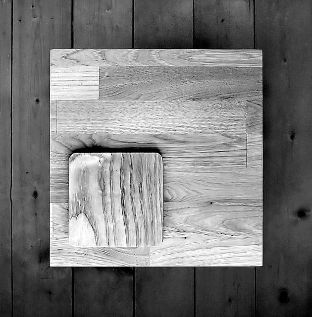
| highlights a bit bright but good overall....did you think about moving the square off-centre, might have ben more dramatic and mirrored the smallest square's position? |
|
 Photographer found comment helpful. Photographer found comment helpful. |
|
|
07/29/2005 09:25:19 AM |
| Nice idea and nice picture. But somehow, the two shades of grey compete for my attention. And the lighter blocks of wood somehow seem to hurt the eye...Maybe a less brighter shade would have been better? Just thinking aloud. :) |
|
| Photographer found comment helpful. |
|
|
07/28/2005 10:09:09 PM |
| This is very clever and the use of some burning would have drawn out the grain much better. Unfortunately, the top two pces seem washed out. Goodluck! |
|
| Photographer found comment helpful. |
|
|
07/28/2005 03:06:35 PM |
| very cool, is that the coolest thing you've done on your deck? :-) I would love to see another photoshopped version with the top wood piece being a shade between the deck and the first layer, just so my curiosity would be satisfied. My guess is it would be different, but not necessarily better. This is the best fit to the challenge I've seen, and a visually interesting photograph too. Well done! 10 |
|
| Photographer found comment helpful. |
|
|
07/27/2005 08:50:14 AM |
| nice idea, i like the texture and your ligting control |
|
| Photographer found comment helpful. |
|
|
07/26/2005 03:38:37 PM |
| I played around with this and added the colour back. It looked better, to me, especially when the bottom layer is a light oak colour. |
|
| Photographer found comment helpful. |
|
|
07/26/2005 03:13:14 AM |
Thank you for being creative.. if I had to see another tree or stack of pencils and logs I was going to shoot myself.
I like the way the lines contrast, maybe I would have offset the middle element. |
|
| Photographer found comment helpful. |
|
|
07/25/2005 08:02:19 PM |
Subject Impact: Nice visual impact
Meets Challenge: Meets Challenge
Technical: OK
Composition: Good
Creativity: Good Idea
Score: 5 |
|
| Photographer found comment helpful. |
|
|
07/25/2005 05:45:14 PM |
| This is pretty cool. Reminds me of Rothko, or at least the abstract expressionists. Very well done. Like the shadowing that give the image a good 3 dimensional quality. Really rather fascinating when you look at it. 9 - good luck in the challenge! |
|
| Photographer found comment helpful. |
|
|
07/25/2005 01:04:47 PM |
| Great texture and contrast. Fun composition! |
|
| Photographer found comment helpful. |
|
|
07/25/2005 11:34:22 AM |
| A really cool abstract...nice and crisp....great tonality and depth...one of my very favorites in the challenge...so simple but very appealing. |
|
| Photographer found comment helpful. |
|
|
07/25/2005 07:51:06 AM |
|
| Photographer found comment helpful. |
|
|
07/25/2005 12:41:57 AM |
| Nice and crisp. Great simplicity in this shot.Great lines. Good use of b&w. |
|
| Photographer found comment helpful. |
Home -
Challenges -
Community -
League -
Photos -
Cameras -
Lenses -
Learn -
Help -
Terms of Use -
Privacy -
Top ^
DPChallenge, and website content and design, Copyright © 2001-2025 Challenging Technologies, LLC.
All digital photo copyrights belong to the photographers and may not be used without permission.
Current Server Time: 03/17/2025 07:17:38 AM EDT.