| Author | Thread |
|
|
05/14/2003 04:09:44 PM |
| Too bad this did so poorly, good work. |
|
Comments Made During the Challenge  |
|
|
05/13/2003 06:40:52 PM |
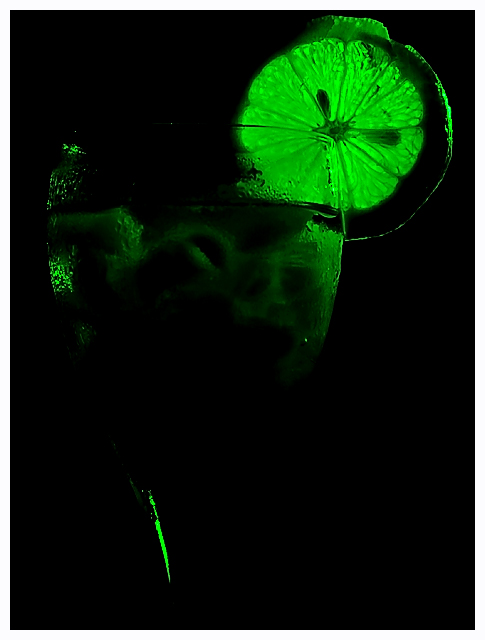
| interesting, i like the green but there is too much black space |
|
|
|
05/13/2003 03:42:43 PM |
|
|
|
05/11/2003 11:14:45 PM |
| i think the photo would have been more powerful if the liquid in the elixer also glowed in the photo. as it is i can see the details of the glass come out very sharply - where visible, but much of it isn't visible. |
|
 Photographer found comment helpful. Photographer found comment helpful. |
|
|
05/11/2003 12:42:39 PM |
| Great colour - just a bit too dark. |
|
| Photographer found comment helpful. |
|
|
05/09/2003 06:22:01 PM |
| I like the glow in this image. I think the viewers attention is mostly on the fruit ring, rather than the effect of glass. But I tend to like this image. |
|
| Photographer found comment helpful. |
|
|
05/09/2003 04:53:05 PM |
| Ah! I love this picture and the green concept! Only it's too dark at the bottom. Darn it, I wish I could rate it a 9 or 10. Maybe if you would have cropped the bottom half off..... Kudos for originality and creativity! |
|
| Photographer found comment helpful. |
|
|
05/09/2003 12:12:48 AM |
| A little to dark for my taste. The idea was good. |
|
|
|
05/08/2003 02:09:57 PM |
| Nice use of light it adds to the focus of your photo. |
|
| Photographer found comment helpful. |
|
|
05/07/2003 11:48:37 PM |
| the glass really doesnt seem to be the main subject here |
|
|
|
05/07/2003 08:21:00 PM |
| The lemon is the highlight here and there is too little of the glass visible. The top right corner would be great for some other challenge. |
|
|
|
05/07/2003 07:57:39 PM |
| I know I won't be the only one to say this, but I'd lighten it a liiiiitle. I get what you're going for, and I like the idea, I'd just like a little more to go on. |
|
|
|
05/07/2003 02:02:54 PM |
| cool shot, just a bit too dark for my liking.... just short of being a really really cool shot.... |
|
|
|
05/07/2003 01:47:27 PM |
|
|
|
05/07/2003 11:00:22 AM |
| Bit too dark for my taste, shade of green is good |
|
|
|
05/07/2003 05:21:52 AM |
| Its kind of too dark, its hard to see the subject |
|
|
|
05/07/2003 01:29:08 AM |
| Very cool shot, I like the green, very vibrant. The glass doesn't seem to be the main subject of the shot but it's definitely there, and I think I like that. The white border seems a bit much, maybe a thin 1 pixel white border with another 10 pixel black border outside that owuld have looked better, or no border at all. nice abstraction. well done. |
|
| Photographer found comment helpful. |
Home -
Challenges -
Community -
League -
Photos -
Cameras -
Lenses -
Learn -
Help -
Terms of Use -
Privacy -
Top ^
DPChallenge, and website content and design, Copyright © 2001-2025 Challenging Technologies, LLC.
All digital photo copyrights belong to the photographers and may not be used without permission.
Current Server Time: 03/12/2025 08:12:08 AM EDT.