| Author | Thread |
Comments Made During the Challenge  |
|
|
07/31/2005 05:21:24 AM |
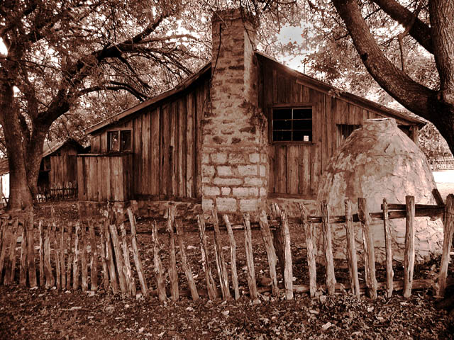
| there is a gray blob to the right of the chimney. Looks like you tried to burn out a distraction but created a bigger one. A real shame as it ruins an otherwise nice photo. |
|
 Photographer found comment helpful. Photographer found comment helpful. |
|
|
07/30/2005 10:41:32 PM |
| nice tones. the sepia works well here. |
|
| Photographer found comment helpful. |
|
|
07/30/2005 12:45:22 PM |
Fit Challenge Criteria: 1/2
Color/Contrast: 2/2
Composition: 2/2
Photo Quality: 1/2
My Subjective Affinity: 1/2
Really nice photo. Tonal range is very good. The fence could stand out better against the ground and could be a little sharper with more detail. |
|
| Photographer found comment helpful. |
|
|
07/29/2005 08:46:54 AM |
| very nice, the whole frime represent wood, i like it, good luck |
|
| Photographer found comment helpful. |
|
|
07/28/2005 12:15:07 PM |
|
| Photographer found comment helpful. |
|
|
07/27/2005 01:58:37 PM |
| Very rustic. Love the fence there. I may try toning down the saturation a bit more. Also, looks like an un-natural gray splotch to the right of the chimney (maybe from burning a hot spot??). |
|
| Photographer found comment helpful. |
|
|
07/26/2005 05:42:00 AM |
| The tones in this are very good, helping to bring the wood into the challenge...8 |
|
| Photographer found comment helpful. |
|
|
07/25/2005 02:29:53 PM |
| effective use of sepia gives a feeling of age, good dof, sharp, don't like the fence- does nothing as blends in too much but `I do not expect you could move it! |
|
| Photographer found comment helpful. |
|
|
07/25/2005 02:28:34 PM |
| Very pretty. I like the tone. This is the kind of place I want to live.... |
|
| Photographer found comment helpful. |
|
|
07/25/2005 09:03:10 AM |
| Great use of sepia. Maybe shoot it from the side for a bit more visual interest. I like the old wooden fence with it's uneven posts. That object to the right (Chiminea?) doesn't add anything to the photo so you could even crop it out, and you might miss some of the cabin, but it would still be a nice shot. |
|
| Photographer found comment helpful. |
|
|
07/25/2005 03:29:08 AM |
| Why not use the colors?? It is very flat as it is. |
|
| Photographer found comment helpful. |
|
|
07/25/2005 12:33:54 AM |
the sepia works well here
6 for now |
|
| Photographer found comment helpful. |
|
|
07/25/2005 12:25:44 AM |
| I love this photo. It seems a bit too red. I think b/w or a sepia tone would serve it better :) |
|
| Photographer found comment helpful. |
Home -
Challenges -
Community -
League -
Photos -
Cameras -
Lenses -
Learn -
Help -
Terms of Use -
Privacy -
Top ^
DPChallenge, and website content and design, Copyright © 2001-2025 Challenging Technologies, LLC.
All digital photo copyrights belong to the photographers and may not be used without permission.
Current Server Time: 03/17/2025 02:47:52 AM EDT.