| Author | Thread |
Comments Made During the Challenge  |
|
|
07/30/2005 09:04:10 PM |
Fit Challenge Criteria: 2/2
Color/Contrast: 1/2
Composition: 2/2
Photo Quality: 0/2
My Subjective Affinity: 0/2
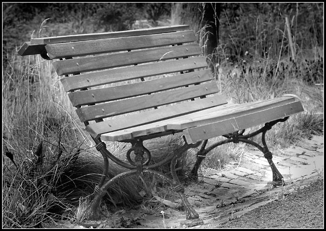
This could have been a winning photo, but the obvious dodging/burning was done very poorly on the weeds behind the bench and under it. More time could have rendered much better results, and possible a blue ribbon. |
|
 Photographer found comment helpful. Photographer found comment helpful. |
|
|
07/30/2005 05:08:10 PM |
| a bit rough on the dodging but nicely composed |
|
| Photographer found comment helpful. |
|
|
07/30/2005 04:39:49 PM |
|
| Photographer found comment helpful. |
|
|
07/30/2005 09:20:23 AM |
| It looks like you dodged the grass to much along with the bench! |
|
| Photographer found comment helpful. |
|
|
07/29/2005 12:04:06 AM |
| Did you use the dodge tool on the bench? I find that the light halo around the edges is a bit distracting. Otherwise, great subject for the challenge and I like the angle at which it was taken with the foilage in the background. |
|
| Photographer found comment helpful. |
|
|
07/28/2005 10:02:30 PM |
| Nice subject but slightly too much dodging. Burning the bench may have drawn out greater detail and the use of the shadow/highlight adjustment may have resulted in more impact. Good luck! |
|
| Photographer found comment helpful. |
|
|
07/28/2005 05:14:06 PM |
| how old is this bench, really? |
|
| Photographer found comment helpful. |
|
|
07/28/2005 05:01:26 PM |
| So simple yet so beautiful. Nice composition. |
|
| Photographer found comment helpful. |
|
|
07/27/2005 02:03:25 PM |
| It looks as though you tried to dodge the bench and left a halo around it. If this is what you wanted to do I am not sure I care for it, if you were trying to lighten up the bench you need to first make a selection out of it and then dodge. |
|
| Photographer found comment helpful. |
|
|
07/27/2005 08:35:30 AM |
Subject Impact: Doesn't really grab me
Meets Challenge: Meets Challenge
Technical: There is a disturbing halo around the bench.
Composition: Good
Creativity: Doesn't seem very creative
Score: 3 |
|
| Photographer found comment helpful. |
|
|
07/26/2005 11:04:25 PM |
| Interesting the way the bench kind of "glows"...it does look a little staged, not natural. Nice shot, nicely framed. |
|
| Photographer found comment helpful. |
|
|
07/26/2005 09:33:53 PM |
| your burning is way too obvious, use a smaller brush next time |
|
| Photographer found comment helpful. |
|
|
07/26/2005 01:45:26 PM |
|
| Photographer found comment helpful. |
|
|
07/25/2005 01:41:39 PM |
| Nice choice for a B&W. A solid shot, overall. |
|
| Photographer found comment helpful. |
|
|
07/25/2005 11:33:58 AM |
| Potentially a nice shot, but painfully overprocessed. The lighter color around the bench betrays your use of Burn around the subject. PS should be used with subtlety to enhance the image, not distract from it. |
|
| Photographer found comment helpful. |