| Author | Thread |
Comments Made During the Challenge  |
|
|
07/31/2005 11:38:51 PM |
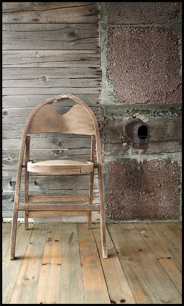
| Great pic. It seems there could be a tad more contrast . . . |
|
|
|
07/28/2005 05:17:52 PM |
| great constrast of the age of wood |
|
|
|
07/27/2005 12:33:06 PM |
| like to have seen this in black and white |
|
|
|
07/27/2005 08:36:12 AM |
Subject Impact: Nice visual impact
Meets Challenge: Meets Challenge
Technical: Average technical form
Composition: Good
Creativity: Very Creative Idea
Score: 7 |
|
|
|
07/27/2005 12:31:51 AM |
| Nicely executed but almost too much wood. I love the chair but the backdrop of wood + the floor is a little distracting. "7* |
|
|
|
07/25/2005 02:04:24 PM |
| lovely textures but not enough contrast |
|
|
|
07/25/2005 01:33:40 PM |
|
|
|
07/25/2005 10:51:59 AM |
| I think this photo wouldve been better for me if the chair had been centered on the dividing walls or the entire photo was one wall or the other(hope that makes sense) still a 7 for me...love the chair |
|
|
|
07/25/2005 09:54:42 AM |
| fairly nice eye pleasing photo. I like the contrast of mute colors, textures and lines. |
|
|
|
07/25/2005 08:39:10 AM |
| Lots of varied wood applications and similar coloration makes for a nice monochromatic theme. I like the off placement of the chair. This might've been fun in black and white with lots of contrast - just a thought. I wish the image were larger so we could see the details of the planks better. |
|
|
|
07/25/2005 12:54:23 AM |
| The layering of the different kins of wood is quite effective |
|
Home -
Challenges -
Community -
League -
Photos -
Cameras -
Lenses -
Learn -
Help -
Terms of Use -
Privacy -
Top ^
DPChallenge, and website content and design, Copyright © 2001-2025 Challenging Technologies, LLC.
All digital photo copyrights belong to the photographers and may not be used without permission.
Current Server Time: 03/16/2025 10:08:38 PM EDT.