| Author | Thread |
|
|
08/06/2005 10:05:20 PM |
** Greetings from the Critique Club **
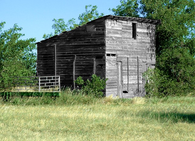
Composition: Would have liked to see this not centered so much, and a little less foreground.
Technically: The sky does not look natural in color - perhaps you adjusted the color range a little too much? It really looks odd against the green of the trees leaves. The greens are nice. Best bet would have been to convert thisto black and white, or sepia tones.
- Linda |
|
 Photographer found comment helpful. Photographer found comment helpful. |
Comments Made During the Challenge  |
|
|
07/27/2005 06:29:03 PM |
| This would have been fun in black and white. I like this photo quite a bit. |
|
| Photographer found comment helpful. |
|
|
07/27/2005 02:04:33 PM |
| nice colors, and looks to be an interesting subject, but for some reason (can't put my finger on it), just doesn't grab me. I know there's something there, though. Maybe a different angle or composition. |
|
| Photographer found comment helpful. |
|
|
07/26/2005 08:28:30 AM |
Subject Impact: Doesn't really grab me
Meets Challenge: Meets Challenge
Technical: Average technical form
Composition: Good
Creativity: Doesn't seem very creative
Score: 5 |
|
| Photographer found comment helpful. |
|
|
07/25/2005 03:13:20 AM |
| Nice composure here. I especially like the angle you used to get the contrast between the 2 sides of the shack. The direct sunlight was used masterfully to highght the darker side of the shack....good eye there! looks like rural Sonoma County. |
|
| Photographer found comment helpful. |
Home -
Challenges -
Community -
League -
Photos -
Cameras -
Lenses -
Learn -
Help -
Terms of Use -
Privacy -
Top ^
DPChallenge, and website content and design, Copyright © 2001-2025 Challenging Technologies, LLC.
All digital photo copyrights belong to the photographers and may not be used without permission.
Current Server Time: 03/12/2025 07:54:46 AM EDT.