| Author | Thread |
|
|
07/28/2005 04:18:14 PM |
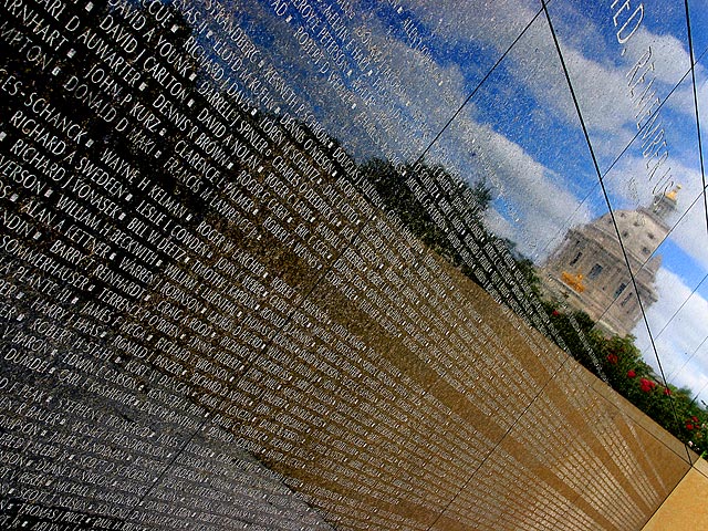
| Some tilt to the wall would have been okay, but I feel that you overdid it a bit. THe reflection is wonderful, and as was said before, the colors are right on, too. I'd say that something like 15-30 degrees counterclockwise would put you in just about the perfect allignment. |
|
 Photographer found comment helpful. Photographer found comment helpful. |
|
|
07/28/2005 03:33:52 PM |
I like the idea behind this shot, but I too feel like it may have been better with a more level angle. I like the aperature setting...I think you were right on with that. The color of the sky is also right on, so I think working with the composition a little bit is my best advice. Nice work!
Dave |
|
| Photographer found comment helpful. |
|
|
07/28/2005 03:09:59 PM |
| My $.02, it's nice as is but I think I'd rather see it without the angle. The names going off into the vanishing point is enough of an angle. ALso, that spot that is not the wall on the bottom right needs to go. |
|
| Photographer found comment helpful. |
Home -
Challenges -
Community -
League -
Photos -
Cameras -
Lenses -
Learn -
Help -
Terms of Use -
Privacy -
Top ^
DPChallenge, and website content and design, Copyright © 2001-2025 Challenging Technologies, LLC.
All digital photo copyrights belong to the photographers and may not be used without permission.
Current Server Time: 03/12/2025 10:06:55 AM EDT.