| Author | Thread |
Comments Made During the Challenge  |
|
|
08/02/2005 10:11:46 PM |
| Unique take on the challenge. Fun composition. |
|
|
|
08/01/2005 04:31:30 PM |
| The radical angle and large amount of white space takes away from the overall presentation, IMO. Still, not a bad shot at all. |
|
|
|
07/31/2005 01:36:48 PM |
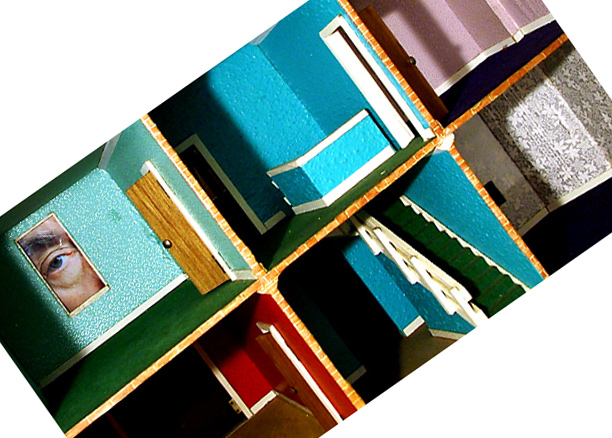
you should have filled the frame with this.. the white off-centre borders don't work for me
|
|
|
|
07/30/2005 10:59:03 AM |
| the odd tilt and addition of all that white space puzzles me. if the white were black it would be better, the white just overpowers the content of your photo. I really like the idea of the photo before the rotate, I would like to see that |
|
|
|
07/30/2005 09:28:46 AM |
| Really clever concept. The diagonal doesn't quite do it for me. |
|
|
|
07/30/2005 09:21:01 AM |
| The big areas of white space are a distraction to me, and the image quality seems quite low somehow. Too much processing perhaps? I'm not sure. |
|
|
|
07/30/2005 03:18:50 AM |
| Why the angle? Doesn't really appeal to me. |
|
|
|
07/30/2005 12:17:35 AM |
| I love the idea but hate the cropping. If it were'nt white, maybe red or black...? Oh well, what can ya do in only 24hrs :) good luck! |
|
Home -
Challenges -
Community -
League -
Photos -
Cameras -
Lenses -
Learn -
Help -
Terms of Use -
Privacy -
Top ^
DPChallenge, and website content and design, Copyright © 2001-2025 Challenging Technologies, LLC.
All digital photo copyrights belong to the photographers and may not be used without permission.
Current Server Time: 03/12/2025 12:40:58 PM EDT.