| Author | Thread |
|
|
08/15/2005 03:34:16 AM |
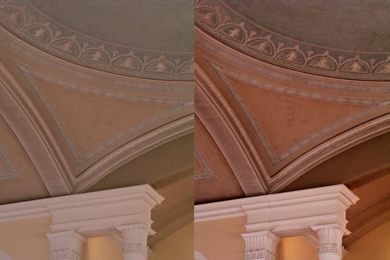
| I think this is your best selective color- you really brought the detail that would otherwise have been lost. I think part of it is knowing which photos it will work well with. |
|
 Photographer found comment helpful. Photographer found comment helpful. |
|
|
08/04/2005 12:17:09 AM |
good job bringing back the contrasts with selective color... the coloring can be seen as falling into the murky region where different people have different tastes, but i personally like it over the original. For more practice with selective color try the 'making skies bluer' section in the original assignment post. best of luck.
ps - you seem to be getting it :-) |
|
| Photographer found comment helpful. |
|
|
08/02/2005 04:14:49 PM |
| It does look somewhat better, but I am inclined to think that it is more due to the inreased contrast than selective color. I sort of prefer the color scheme to the original - maybe some curves work would really make it pop? |
|
| Photographer found comment helpful. |
|
|
08/02/2005 02:37:14 PM |
| That's pretty much what I've learned as well. It is hard. You did a great job bringing out the details in this photo and the color is much more pleasing to my eye. |
|
| Photographer found comment helpful. |
Home -
Challenges -
Community -
League -
Photos -
Cameras -
Lenses -
Learn -
Help -
Terms of Use -
Privacy -
Top ^
DPChallenge, and website content and design, Copyright © 2001-2025 Challenging Technologies, LLC.
All digital photo copyrights belong to the photographers and may not be used without permission.
Current Server Time: 03/13/2025 05:26:19 AM EDT.