| Author | Thread |
|
|
08/16/2005 05:18:29 PM |
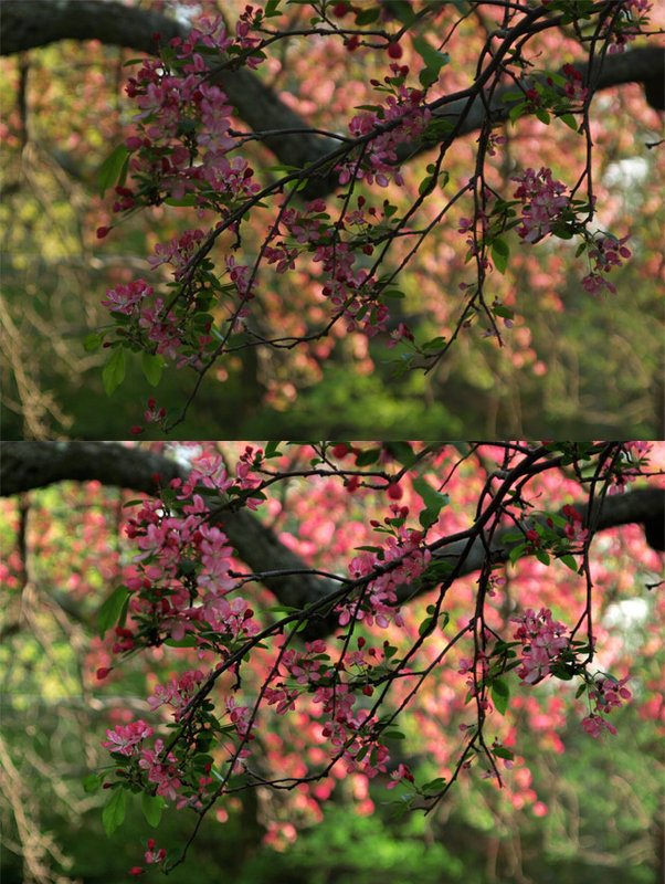
| I hate being last to comment because I have basically the same things to say! :0) I wonder is there's an easy way to mask out the background? But the greens really look vastly improved too. good work! |
|
 Photographer found comment helpful. Photographer found comment helpful. |
|
|
08/05/2005 10:26:32 PM |
there ya go! you are getting the hang of it. selective color is a very useful tool once you become familiar with how it works, and practice certainly makes perfect!
Ill agree with the two previous comments about the background being a bit distracting but i thinks its hard to judge on this scale and i think for practicing a new tool you definetely suceeded. |
|
| Photographer found comment helpful. |
|
|
08/02/2005 04:06:44 PM |
| Very nice - you've added pop while keeping a natural feel (on my monitor). Laura has a point though, the background does draw most of the attention. If you know how to use masks, perhaps you can emphasize the effect on the foreground. |
|
| Photographer found comment helpful. |
|
|
08/02/2005 02:42:46 PM |
IMO the colors in the background are a little too bright. The pink seems to draw my eye away from the flowers in the front. Maybe another curves adjustment would increase the contrast and seperate the foreground from the background.
The difference here is pretty noticable though. You seem to have gotten a handle on it.
Message edited by author 2005-08-02 14:43:40. |
|
| Photographer found comment helpful. |
Home -
Challenges -
Community -
League -
Photos -
Cameras -
Lenses -
Learn -
Help -
Terms of Use -
Privacy -
Top ^
DPChallenge, and website content and design, Copyright © 2001-2025 Challenging Technologies, LLC.
All digital photo copyrights belong to the photographers and may not be used without permission.
Current Server Time: 03/13/2025 04:21:43 AM EDT.