| Author | Thread |
|
|
05/21/2003 11:18:09 AM |
Critique Club Critique
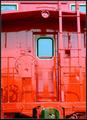
Title: "Cinnamon Red" by StevePax
Composition: A very original and well-composed shot. The overall result is that of a commercial picture for advertisement. I feel the negative space adds to this picture giving it a hot feel.
Technical: All of the ingredients for a perfect photo are in this one. You show very good control of light and have used it to your advantage. The focus seems to be ever so slightly off, that may have been on purpose, but I feel the lettering would be absolutely sharp if it were to be used as a commercial picture. I keep going beck to that commercial thing but it just has that effect on me.
Challenge: You have met the challenge, however I think most entries were centered around using all three primary colors. Nothing said it was necessary though. Your use of only red gives it what I call simple elegance.
Suggestions: I think the subject in your picture narrows the field of viewers that would be very interested in having it on their wall. It definitely has a place though, which I have mentioned already. I a deserved 7 on this entry, and only whish I could accomplish the control of light that you have. Your "Orange County, CA" postcard entry is another very nice example of light control. It has been a pleasure to critique your work, so keep shooting and have fun!
Dick
Disclaimer:
Bear in mind that I am here to learn, just as many others and any comments that I have made are not intended to be offensive in any way, and are only constructive criticisms. If you wish to comment or discuss this critique please feel free to do so at any time.
Thank you,
Dick Pattee (Autool)
Autool@attbi.com
|
|
 Photographer found comment helpful. Photographer found comment helpful. |
|
|
05/19/2003 12:55:48 AM |
| Hi Steve! Nice shot! I suppose that those photos with all three colors did better in the challenge, but this is a really dynamic, groovy shot. Thank your wife! |
|
| Photographer found comment helpful. |
Comments Made During the Challenge  |
|
|
05/18/2003 03:30:47 PM |
| Attention getting and creative. |
|
| Photographer found comment helpful. |
|
|
05/16/2003 10:50:18 AM |
| This is an excellent photo, well done you deserve a top score! |
|
| Photographer found comment helpful. |
|
|
05/15/2003 10:17:58 PM |
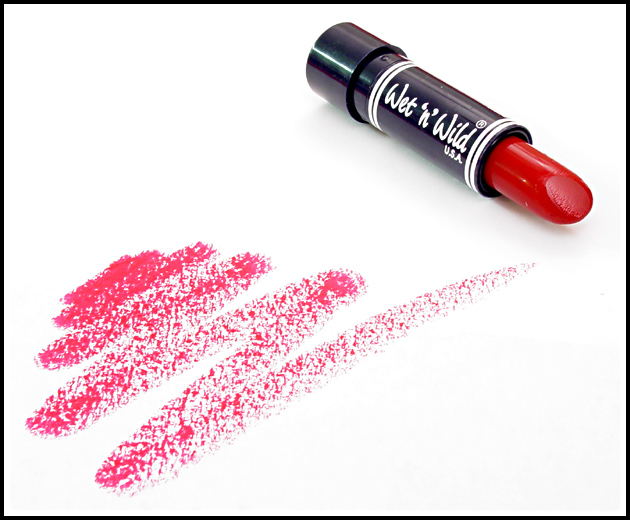
This is a very well done shot. Great lighting (almost deleted all of the shadow) no harsh areas. I guess the only thing I can say is that touch tighter focus (if you want it tack sharp) at the lettering.
Still not totally sure on the challenge for having all three colors, but who cares...7 |
|
| Photographer found comment helpful. |
|
|
05/15/2003 07:14:13 PM |
| I like this idea. looks like an ad. I would have used a different lipstick to make the shot look more glamorous though. Wet n Wild just doesn't cut it :) Seriously though, the color on the paper is a little too magenta in color but great composition. |
|
| Photographer found comment helpful. |
|
|
05/15/2003 05:34:29 PM |
| Good photo. i really like the texture of the lipstick smear. |
|
| Photographer found comment helpful. |
|
|
05/15/2003 11:50:29 AM |
| Torn on this shot. I like the composition - don't like the blown out background. I like the red, but it's lacking blues and yellows to make it perfect. Great shot though. |
|
| Photographer found comment helpful. |
|
|
05/14/2003 10:53:41 AM |
| I like this very much, and it has inspired me to experiment with lipstick! Good job! |
|
| Photographer found comment helpful. |
|
|
05/13/2003 10:39:54 PM |
| Simple, high key used effectively. I would like to have seen the other primary colors included. The leading line from the lipstick on the paper to the lipstick works nicely. 7 -danny |
|
| Photographer found comment helpful. |
|
|
05/13/2003 02:44:53 PM |
|
| Photographer found comment helpful. |
|
|
05/12/2003 11:41:10 PM |
| Love the perfect white background. I never get that right. Good job. Like to see yellow and blue also, but this is pretty good. |
|
| Photographer found comment helpful. |
|
|
05/12/2003 08:15:17 PM |
| I would have liked the markings more solid |
|
| Photographer found comment helpful. |
|
|
05/12/2003 06:42:50 PM |
|
| Photographer found comment helpful. |
|
|
05/12/2003 12:19:24 PM |
| The good 'n cheap brand! Everyone loves wet 'n wild! |
|
| Photographer found comment helpful. |
|
|
05/12/2003 10:51:02 AM |
| nicely composed and executed, although i think the lipstick marks look more like (red) charcol/pencil rubbings than lipstick (might have considered a real kiss imprint). good lighting. |
|
| Photographer found comment helpful. |
Home -
Challenges -
Community -
League -
Photos -
Cameras -
Lenses -
Learn -
Help -
Terms of Use -
Privacy -
Top ^
DPChallenge, and website content and design, Copyright © 2001-2025 Challenging Technologies, LLC.
All digital photo copyrights belong to the photographers and may not be used without permission.
Current Server Time: 03/12/2025 07:20:59 PM EDT.