| Author | Thread |
|
|
05/03/2006 12:33:50 PM |
| this one fits the challeng well :) mabey if it wasn't such a tight crop it would have done better? i don't know, i like it! |
|
 Photographer found comment helpful. Photographer found comment helpful. |
Comments Made During the Challenge  |
|
|
08/07/2005 09:23:11 PM |
|
| Photographer found comment helpful. |
|
|
08/07/2005 03:06:50 PM |
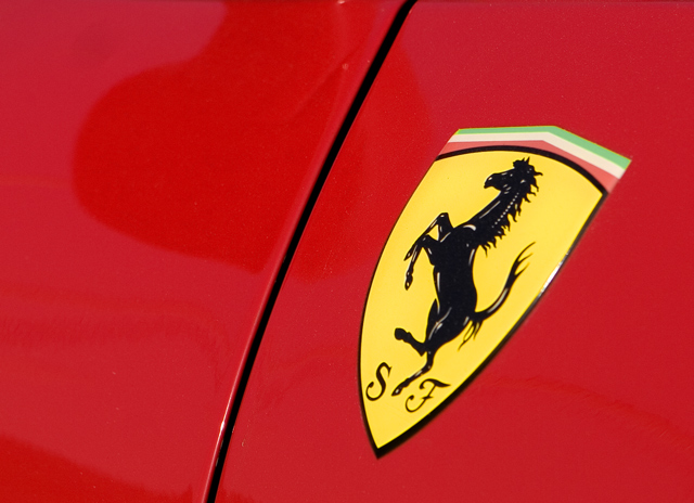
| The shadow on the hood is disturbing. |
|
| Photographer found comment helpful. |
|
|
08/07/2005 05:03:13 AM |
| Very vivid. Nice color and lighting |
|
| Photographer found comment helpful. |
|
|
08/03/2005 05:51:44 PM |
| Lots of Ferrari pics but I like this one - very simple, like the composition. |
|
| Photographer found comment helpful. |
|
|
08/03/2005 10:29:45 AM |
| The logo says it all. I don't know the first thing about cars, but this one is a no brainer. |
|
| Photographer found comment helpful. |
|
|
08/03/2005 09:37:21 AM |
| Off center subjects may be promoted, but in this case, IMO, the logo should have been dead center. |
|
| Photographer found comment helpful. |
|
|
08/03/2005 09:20:53 AM |
| Good take on a car shot. Great composition and color contrast. Good one. The simplicity is so much more effective than showing the entire car. GOOD ONE> |
|
| Photographer found comment helpful. |
|
|
08/03/2005 12:45:02 AM |
| Yes, now that means affluence. |
|
| Photographer found comment helpful. |
Home -
Challenges -
Community -
League -
Photos -
Cameras -
Lenses -
Learn -
Help -
Terms of Use -
Privacy -
Top ^
DPChallenge, and website content and design, Copyright © 2001-2025 Challenging Technologies, LLC.
All digital photo copyrights belong to the photographers and may not be used without permission.
Current Server Time: 03/14/2025 01:05:55 PM EDT.