| Photograph Information |
Photographer's Comments |
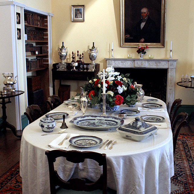
Challenge: Affluence (Basic Editing III)
Camera: Canon EOS-300D Rebel
Lens: Canon EF-S 18-55mm f/3.5-5.6
Location: Arlington Cemetary
Date: Aug 2, 2005
Aperture: f8
ISO: 400
Shutter: 2sec
Galleries: Family, Still Life
Date Uploaded: Aug 2, 2005
|
Ridiculous camera settings--I really should pay more attention to that! Hand-held at 2 seconds,,,,ah c'mon! Don't I know any better?
crop, levels, hue and sat on yellow and reds, sharpen, resize, sharpen
Not your everyday setting--in any century. Servants required.
Entering it because I need to maintain my 5.3 average and I can't stand another day without an update button....oh, and this is as close as I could come to anything affluent--even if the affluent related to this picture are long gone and deeply buried. :-)
--
Well I predicted my score pretty well, I think.
Yes the red is oversaturated on the portrait--noticed it too late.
I like the grain.
This is taken in the historic home of General Lee in Arlington--had I crossed the velvet rope to add people or remove the small painting, I'm sure I wouldn't have got home in time to submit this to the challenge. :-) |
| Author | Thread |
Comments Made During the Challenge  |
|
|
08/09/2005 09:43:47 PM |
| The life of imported enamel and silver dishes. Quite a display. |
|
 Photographer found comment helpful. Photographer found comment helpful. |
|
|
08/09/2005 07:18:16 PM |
| Like the idea - the leaning bookcase is a bit distracting though |
|
| Photographer found comment helpful. |
|
|
08/09/2005 05:04:39 PM |
| 6. A touch to grainy for my taste. |
|
| Photographer found comment helpful. |
|
|
08/07/2005 07:07:53 PM |
| the picture seems a little bit grainy |
|
| Photographer found comment helpful. |
|
|
08/07/2005 03:09:02 PM |
| Nice this would have been great with the addition of people. also the slanting lines of the book case are distracting It makes the room feel slanted. I would have also removed the small photograph on the wall. |
|
| Photographer found comment helpful. |
|
|
08/07/2005 05:14:01 AM |
| Very elegant dining room. Seems a little blurry, though, and the reds look oversaturated as the man in the portrait appears to have a horrible rash on his face. |
|
| Photographer found comment helpful. |
|
|
08/06/2005 09:35:05 AM |
| VERY NICE, ELEGANT AND SIMPLY STATED |
|
| Photographer found comment helpful. |
|
|
08/04/2005 08:36:07 PM |
| perhaps the best depiction of the theme....10 |
|
| Photographer found comment helpful. |
|
|
08/03/2005 10:07:24 AM |
| A bit too much noise here for my taste. |
|
| Photographer found comment helpful. |
|
|
08/03/2005 02:44:37 AM |
| seems to be a lot of noise in this image |
|
| Photographer found comment helpful. |
Home -
Challenges -
Community -
League -
Photos -
Cameras -
Lenses -
Learn -
Help -
Terms of Use -
Privacy -
Top ^
DPChallenge, and website content and design, Copyright © 2001-2025 Challenging Technologies, LLC.
All digital photo copyrights belong to the photographers and may not be used without permission.
Current Server Time: 03/14/2025 09:28:09 AM EDT.