| Author | Thread |
|
|
08/11/2005 07:13:06 PM |
| This one is perfect! The tonal range is especially good. The yellowish tone is very subtle but works great. good job! :0) |
|
 Photographer found comment helpful. Photographer found comment helpful. |
|
|
08/10/2005 10:06:53 PM |
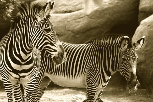
| Wow. This really caught my eye in passing through several photos. Great job with the duotones. I almost feel as if I'm looking in some safari expedition journal from the 1920's. Bravo! |
|
| Photographer found comment helpful. |
|
|
08/10/2005 01:53:13 PM |
| Don't you love how the whiskers stand out? This duotone is a very pleasing color. It is so easy to look at. I think the color choice helps the viewer to get lost in all those stripes. If you look at the zebras suddenly all you see id the pattern of the stripes, not the animal, particularly down where the legs asll blend together ans where the two zebras overlap each other. |
|
| Photographer found comment helpful. |
|
|
08/05/2005 04:02:58 PM |
| I love this alot. Duotones work so well with this kind of contrast! I don't think anything could have more contrast than a zebra and we got two !!! The natural placement is really an addition to the shot. I love their whiskers. |
|
| Photographer found comment helpful. |
|
|
08/05/2005 02:42:55 PM |
| Same here - while it's certainly not a bad choice to duotone given the already black and white nature of the zebras - I think treatment may be a tad much in the blacks and whites. |
|
| Photographer found comment helpful. |
Home -
Challenges -
Community -
League -
Photos -
Cameras -
Lenses -
Learn -
Help -
Terms of Use -
Privacy -
Top ^
DPChallenge, and website content and design, Copyright © 2001-2025 Challenging Technologies, LLC.
All digital photo copyrights belong to the photographers and may not be used without permission.
Current Server Time: 03/13/2025 05:55:52 AM EDT.