| Author | Thread |
|
|
08/21/2005 04:23:26 PM |
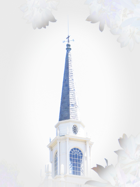
| I find myself much more drawn to this picture than the challenge entry as well. The post processing makes a huge difference to me: in this one the white space looks intentional, and in the other it looked accidental. This is a gentle and soothing image (and more impressive to me for you use of white, which I am forever afraid to use!). |
|
|
|
08/08/2005 05:25:26 AM |
| Really like this version much better. I wish it were possible to have hindsight early! |
|
|
|
08/08/2005 03:03:19 AM |
| I like the blue pass on this version Paul. The only thing that bothers me a tad is that there's hints of a slight orange/red color from the leaves. Since this is a high key image, I suggest using a frame to keep the eye from wandering elsewhere. Great job! |
|
|
|
08/08/2005 02:42:42 AM |
| Ooh, now that's VERY nice. |
|
 Photographer found comment helpful. Photographer found comment helpful. |
Home -
Challenges -
Community -
League -
Photos -
Cameras -
Lenses -
Learn -
Help -
Terms of Use -
Privacy -
Top ^
DPChallenge, and website content and design, Copyright © 2001-2025 Challenging Technologies, LLC.
All digital photo copyrights belong to the photographers and may not be used without permission.
Current Server Time: 03/12/2025 06:54:37 PM EDT.