| Author | Thread |
|
|
08/17/2005 06:50:57 AM |
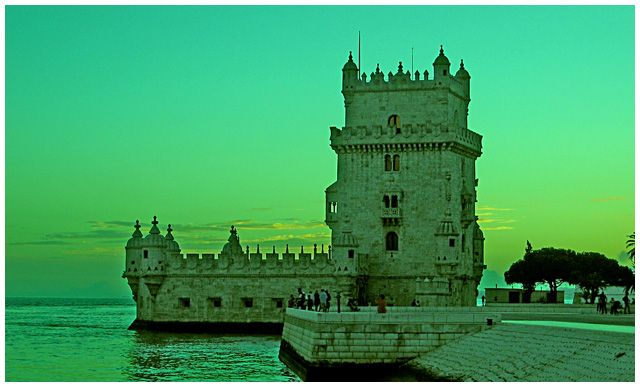
The tourists in modern clothing don't fit the time.
Message edited by author 2005-08-17 19:40:58. |
|
 Photographer found comment helpful. Photographer found comment helpful. |
Comments Made During the Challenge  |
|
|
08/16/2005 06:11:38 PM |
| i like the coloring in this one, i just wish the people weren't there....still a nice shot. |
|
| Photographer found comment helpful. |
|
|
08/16/2005 02:01:11 PM |
| I'm not sure i like the green tones here, but compositionally I think this could be a very strong image. 5 |
|
| Photographer found comment helpful. |
|
|
08/16/2005 11:39:41 AM |
| The color seems a bit off...too green. Otherwise, a good shot! |
|
| Photographer found comment helpful. |
|
|
08/16/2005 07:34:00 AM |
| Wow! That's a lot of green. |
|
| Photographer found comment helpful. |
|
|
08/14/2005 11:11:07 PM |
| Love the emerald tones. This is an interesting take. I like it alot. |
|
| Photographer found comment helpful. |
|
|
08/14/2005 10:57:57 PM |
| too green, the "USM halo" is too obvious and detracts from the image, nice clouds in background |
|
|
|
08/13/2005 08:42:42 PM |
4 - I like the concept but even at (in my opinion and interpretation of the Challenge, a photo of this put into a time capsule to depict the era for future generations) a little stretch I 'don't buy it' as a true depiction. Criticism; The people (tourists?) are way too distracting/detracting for me. The color treatment, while interesting, and has potential, doesn't work here in my opinion. Maybe if you had a different angle or, a different crop, blurred out the 'people', might have made this better in my opinion. That said, I would also like to see a lot more definition and detail on the castle, so perhaps closer with that sky as the backdrop, not sure. edit: typo/grammar
Message edited by author 2005-08-17 08:19:44. |
|
|
|
08/13/2005 01:21:20 PM |
| Get those darn tourists out of there. :) |
|
| Photographer found comment helpful. |
|
|
08/13/2005 12:22:15 AM |
| I really like the subject, but not the green hue. |
|
| Photographer found comment helpful. |
|
|
08/11/2005 03:07:56 PM |
| WOW, wonderfull photograph~!i love the green hue~! wonderfull~! |
|
| Photographer found comment helpful. |
|
|
08/11/2005 02:24:32 PM |
| The green hue doesn't really do this picture justice. I think a sepia tone or B&W would have been better. |
|
| Photographer found comment helpful. |
|
|
08/10/2005 06:38:59 PM |
| Picture is a little green for my taste but I like the setting. |
|
| Photographer found comment helpful. |
|
|
08/10/2005 05:43:44 PM |
| Perhaps it would look better at sunrise... the colours are a bit "weird" IMHO. |
|
|
|
08/10/2005 01:42:27 PM |
| Too bad people had to get in the way. |
|
| Photographer found comment helpful. |
|
|
08/10/2005 12:16:57 PM |
| Hey Portugal right? The green tone and the tourists don't help. Nice image in any case. 7 |
|
| Photographer found comment helpful. |
|
|
08/10/2005 09:50:45 AM |
| very green even for1498 looks like LA in the 60's. Great subject for this challenge, better focus and a change in color choice would have been better IMO |
|
| Photographer found comment helpful. |
|
|
08/10/2005 04:09:58 AM |
| ugly colour cast to this - I'm guessing its intentional, but I don't understand why you chose green |
|
|
|
08/10/2005 02:36:02 AM |
|
| Photographer found comment helpful. |
|
|
08/10/2005 02:00:44 AM |
| i like the green 'plugin' i want it. please be so kind. thanx.7 |
|
| Photographer found comment helpful. |
|
|
08/10/2005 01:22:49 AM |
|
| Photographer found comment helpful. |
|
|
08/10/2005 01:22:32 AM |
| this is my favorite one!! i love the green colors! |
|
| Photographer found comment helpful. |
|
|
08/10/2005 12:35:00 AM |
|
| Photographer found comment helpful. |
Home -
Challenges -
Community -
League -
Photos -
Cameras -
Lenses -
Learn -
Help -
Terms of Use -
Privacy -
Top ^
DPChallenge, and website content and design, Copyright © 2001-2025 Challenging Technologies, LLC.
All digital photo copyrights belong to the photographers and may not be used without permission.
Current Server Time: 03/12/2025 12:44:12 PM EDT.