| Author | Thread |
Comments Made During the Challenge  |
|
|
08/23/2005 11:13:35 AM |
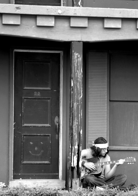
| Very nice. Maybe you could try cropping the top a bit so the top of the porch roof makes a border for the top of the photo. |
|
 Photographer found comment helpful. Photographer found comment helpful. |
|
|
08/22/2005 06:50:40 PM |
| IMHO cropping is poor, should have been tighter on the musican and focus is soft. Dosen't say Live Music to me. 6. |
|
| Photographer found comment helpful. |
|
|
08/22/2005 04:19:44 AM |
| I like it, maybe just a bit to much headroom, cutting ot off just above the top of that pole would have been good. |
|
| Photographer found comment helpful. |
|
|
08/22/2005 01:38:06 AM |
| Nice, 70's photo. Composition is good. Good job. |
|
| Photographer found comment helpful. |
|
|
08/21/2005 06:58:17 PM |
| Overall a very effective shot, Evokes the 1960's. But, I do get the sense it's just slightly out of focus? |
|
| Photographer found comment helpful. |
|
|
08/20/2005 10:42:36 AM |
| I like the contrast here. I wish the subject was more in focus. Good capture. I may have cropped off some of the top so the second story would not show. |
|
| Photographer found comment helpful. |
|
|
08/19/2005 07:16:40 PM |
| Feel like I am back in 60's. Good luck |
|
| Photographer found comment helpful. |
|
|
08/19/2005 08:16:55 AM |
| a bit blurred but nice composition |
|
| Photographer found comment helpful. |
|
|
08/19/2005 01:59:27 AM |
|
| Photographer found comment helpful. |
|
|
08/19/2005 01:18:19 AM |
| What a wonderful capture with a shit load of potential! The blr and the flatness take away from the feeling, but its a keeper!!!! 5 |
|
| Photographer found comment helpful. |
|
|
08/18/2005 06:32:54 PM |
| i think this could have been a good submission for time capsule too! feels very 60's |
|
| Photographer found comment helpful. |
|
|
08/17/2005 10:59:47 PM |
| like the feel of the shot, but focus seems to be a bit soft. Also, IMO, the image gives the appearance of being crooked at the very top. I think that cropping the top off, at the most to the top of the pole would have alleviated this. |
|
| Photographer found comment helpful. |
|
|
08/17/2005 09:09:08 PM |
| I'm sure it's me, but it seems a bit soft. The column seems to distract me quite a bit as well. |
|
| Photographer found comment helpful. |
|
|
08/17/2005 05:28:16 PM |
| I would have cropped out the top 10%. Nice pic! |
|
| Photographer found comment helpful. |
|
|
08/17/2005 05:07:05 PM |
| OOF, not keen on the blue duotone.I like the composition. Doesn't really communicate live music to me. |
|
| Photographer found comment helpful. |
|
|
08/17/2005 04:29:57 PM |
| The fact that the guitarrist is not the largest part of this photograph really captured my attention. The setting of this image (to me) is very important to the image itself, and you have captured it nicely. |
|
| Photographer found comment helpful. |
|
|
08/17/2005 12:54:16 PM |
|
| Photographer found comment helpful. |
|
|
08/17/2005 09:40:00 AM |
| Did you intentionally mean to tilt the picture clockwise? It's very un-nerving for me. |
|
| Photographer found comment helpful. |
Home -
Challenges -
Community -
League -
Photos -
Cameras -
Lenses -
Learn -
Help -
Terms of Use -
Privacy -
Top ^
DPChallenge, and website content and design, Copyright © 2001-2025 Challenging Technologies, LLC.
All digital photo copyrights belong to the photographers and may not be used without permission.
Current Server Time: 03/14/2025 09:27:49 AM EDT.