| Author | Thread |
Comments Made During the Challenge  |
|
|
06/09/2002 09:39:00 PM |
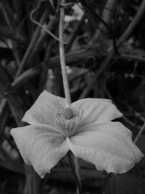
| The whites here, on my machine, look fairly flat. That would be my major suggestion, a little bit more in the highlight range. Beyond that, the only thing I find detracts from the photo is the stickthat goes right throught the middle of the shot. Maybe it wasn't possible to remove it, but maybe a different angle of the main subject so it wasn't in the shot? |
|
|
|
06/09/2002 09:13:00 PM |
| contrast/ lighting needs work but a good subject for B&W |
|
|
|
06/09/2002 02:30:00 PM |
|
|
|
06/08/2002 03:14:00 PM |
| Too much dead space at the top, the light vertical stem is distracting. |
|
|
|
06/07/2002 05:54:00 PM |
| To me, this shot needs a bit more contrast to make the flower more predominant. |
|
|
|
06/06/2002 09:19:00 AM |
| Nice contrast and dof. The stem running up the middle is a little distracting. |
|
|
|
06/05/2002 10:53:00 PM |
| Hmmm...I'm trying to decide the relationship between the title "shallow" or "flat" tone range. Good detail though, not over-sharpened, and I can see it would be hard to lighten it without blowing out the highlights. |
|
|
|
06/05/2002 05:56:00 PM |
| good photo but the background is to distracting |
|
|
|
06/05/2002 05:33:00 AM |
| Very nice composition, but a little bit too grey (on my monitor). |
|
|
|
06/04/2002 07:06:00 PM |
| One of my favorite subjects. I like the composition. I would have dodged the petals to get a bit more texture. |
|
|
|
06/04/2002 12:15:00 PM |
| I've generally liked the images that used black and white to pull out the contrast of their shot, but I really like the dull, almost mysterious mood of your shot. I love the vertical frame of the photograph, though I wish the flower were horizontally centered. |
|
|
|
06/04/2002 05:42:00 AM |
| Could use some brightness - very flat tonal range. Nice texture, but the stem leading in from the top draws the eye away from the flower. You could crop the top away for more impact, IMO. |
|
|
|
06/03/2002 11:54:00 PM |
|
|
|
06/03/2002 09:32:00 PM |
|
|
|
06/03/2002 07:53:00 PM |
| OK pic but too many flower shots here. |
|
|
|
06/03/2002 07:16:00 PM |
| Really nice composition! I suggest that there is not enough contrast for the main subject. Perhaps some additional lighting, maybe using a snoot at low power or something to bring out the texture and add some life to it? |
|
|
|
06/03/2002 06:23:00 PM |
| Cool shot, like the long stem. Could stand to be brighter. I also wonder why you took a picture of a flower (something usually quite colorful) for a B&W challenge. |
|
|
|
06/03/2002 05:46:00 PM |
| Nice picture, I don't like so much grey though, unless of course that was your goal. Nice job overall. |
|
|
|
06/03/2002 05:09:00 PM |
|
|
|
06/03/2002 11:22:00 AM |
|
|
|
06/03/2002 03:01:00 AM |
| This is a nice view but I think it needs a little more light to make the flower really stand out... It would also offer some more contrast and make the subject JUMP out at me a little harder :) |
|
Home -
Challenges -
Community -
League -
Photos -
Cameras -
Lenses -
Learn -
Help -
Terms of Use -
Privacy -
Top ^
DPChallenge, and website content and design, Copyright © 2001-2025 Challenging Technologies, LLC.
All digital photo copyrights belong to the photographers and may not be used without permission.
Current Server Time: 03/14/2025 01:03:08 AM EDT.