| Author | Thread |
|
|
09/10/2005 03:31:13 PM |
|
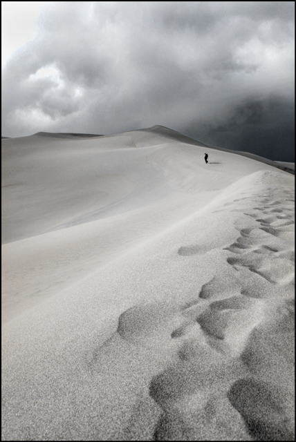
what a strong image. I like the DOF here and the gloomy sky fits well with your theme here. Good work |
|
 Photographer found comment helpful. Photographer found comment helpful. |
|
|
08/19/2005 07:18:02 PM |
Armelle, your photo proves the rule that when you start with a great image, it's easier to end up with a great result. The original image is terrific right out of the camera. It's funny, when I look at the two thumbnails together, I like the edited version best. When I look at the two full size images together I like the original best. I think the contrast in the edited version makes a more dramatic thumb, but the subtle colors are terrific in the original.
I think the magic here would be to obtain the improvements in contrast and the highlighted lines without losing the color. Zed's done a nice job with his edit. Hopefully, you'll try to duplicate his edits to learn how he did them.
We all have our personal bias about color ... from my perspective, if God had wanted us to shoot B&W, he wouldn't have invented color film. Which is to say my personal bias runs toward color. But don't pay too much attention to my personal bias ... it's certainly not universal. |
|
| Photographer found comment helpful. |
|
|
08/19/2005 01:01:05 AM |
Originally posted by armelle:
Zed Pobre: I do like your color rendition! I'll have to try your steps later tonight (although I don't know if Elements has 'selective color' and smart sharpen?). BTW, the figure was some stranger in the distance and I think he was wearing a backpack :) |
Hrm. It probably doesn't have Smart Sharpen, since that's new to CS2. You can buy a plugin called Focus Magic that does pretty much exactly the same thing, though. I don't know if Elements has a Selective Color layer, but that's probably my most commonly used adjustment after Shadow/Highlight. You might be able to get some similar effects out of Hue/Sat, but it's nowhere near as precise. |
|
| Photographer found comment helpful. |
|
|
08/19/2005 12:55:33 AM |
I like your b&w version. Very nice! However, I must agree with the others that the color version is also very nice. The clouds seems to lose some texture in the pp version. Maybe selecting the sky out and fiddling with it on a separate layer?
|
|
| Photographer found comment helpful. |
|
|
08/18/2005 10:48:18 PM |
Thank you everyone for the helpful comments. I have more work ahead!
Zed Pobre: I do like your color rendition! I'll have to try your steps later tonight (although I don't know if Elements has 'selective color' and smart sharpen?). BTW, the figure was some stranger in the distance and I think he was wearing a backpack :)
And concerning your stab at it, I don't mind at all, it actually makes me want to play with the color version again (along with the other comments)... Thanks!
Armelle |
|
|
|
08/18/2005 09:29:23 PM |
I've put together my own color rendition of this (I hope you don't mind):

Steps are in the image description. This may just be a matter of differing taste, however. |
|
| Photographer found comment helpful. |
|
|
08/18/2005 05:54:30 PM |
I much prefer the original to this version, but I think that's because there isn't anything particularly compelling about the image as it stands to warrant the loss of color. The heavy white blown area in the upper left doesn't seem to be present in the original, so I can only attribute it to overdodging. One thing the shift did do is bring out the arcs in the sand on the upper left, but I suspect contrast adjustment might have done that in color as well. I may comment again later tonight after I've had a chance to play with this.
As a composition note unrelated to exposure, the posture of the figure in the distance is odd and hunched, which detracts a bit from the mood. Otherwise, the composition is excellent, with the ridgeline drawing the eye nicely into the distance and up to the clouds. |
|
| Photographer found comment helpful. |
|
|
08/18/2005 02:47:56 PM |
As I looked at the histogram of this shot it seemed a little too light. A minor levels adjustment of the black (40 points) really brought out the contrast in the footsteps in the sand.
As you mentioned, the blownout sky in the top left corner is a bit distracting. Maybe some burn there would help? I don't really know as I have a hard time with the dodge/burn tools.
I have to second Steve's comment. The composition is excellent. It's a great photograph.
- Laura |
|
| Photographer found comment helpful. |
|
|
08/17/2005 08:15:11 AM |
|
Monochromatic tones really work here. Truly stunning in its simplicity. |
|
| Photographer found comment helpful. |
|
|
08/17/2005 07:14:03 AM |
I like this photo but I feel it's a shame you have lost the colour of the original and have ended up with an almost monotone finished photograph.
The contrast and texture is better in this example in both the sand and the sky. I just wonder if you could have achieved the improved contrast without losing the colour?
I know were only supposed to comment on exposure but excellent composition.
Steve |
|
| Photographer found comment helpful. |
Home -
Challenges -
Community -
League -
Photos -
Cameras -
Lenses -
Learn -
Help -
Terms of Use -
Privacy -
Top ^
DPChallenge, and website content and design, Copyright © 2001-2026 Challenging Technologies, LLC.
All digital photo copyrights belong to the photographers and may not be used without permission.
Current Server Time: 06/28/2026 09:12:24 PM EDT.