| Author | Thread |
|
|
06/10/2002 06:44:00 AM |
|
|
|
06/10/2002 06:21:00 AM |
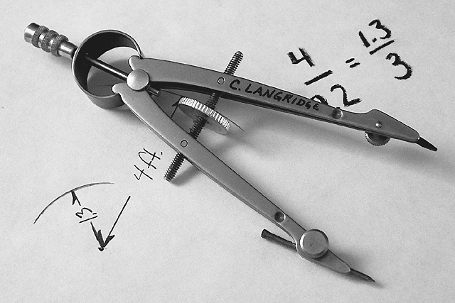
| Just a bit of info; the equation is 4/9.2=1.3/3. There seemed to be some confusion on this but I guess I shouldn't have covered it up so much. I didn't thing people would take notice of the minor details. |
|
Comments Made During the Challenge  |
|
|
06/09/2002 11:56:00 PM |
| awesome shot, i love it. i'd prefer the 22 to not be blocked out. |
|
|
|
06/09/2002 09:10:00 PM |
| strong shot - uncluttered and clean |
|
|
|
06/09/2002 01:32:00 PM |
| Needs tonal adjustments to really stand out. |
|
|
|
06/08/2002 09:40:00 PM |
|
|
|
06/08/2002 02:20:00 PM |
| Clean, crisp, self-explanatory. Very nice! |
|
|
|
06/07/2002 11:52:00 PM |
| nice contrast and a sharp shot |
|
|
|
06/07/2002 11:35:00 PM |
| Beautifully done photo. Excellent composition and lighting. Good tonal range. |
|
|
|
06/07/2002 08:29:00 PM |
|
|
|
06/06/2002 10:26:00 PM |
| I love the steele done in b/w. This is a nice b/w, |
|
|
|
06/06/2002 01:13:00 AM |
| Interesting shot. I like the way the metal comes up in black and white. |
|
|
|
06/06/2002 12:40:00 AM |
| Very nice detail and contrast. The paper could be a little whiter, but I like the texture you can see in it. The writing / drawing could possibly be more consistent looking. The thin and thick lines don't work as well as they could, IMO. Also not sure I like the compass obscuring some of the printing. Small nits. Well done! |
|
|
|
06/05/2002 08:31:00 PM |
|
|
|
06/05/2002 07:17:00 PM |
| Very sharp, great detail, a winner |
|
|
|
06/05/2002 12:27:00 PM |
| Great shot! I am especially impressed with curves and lines of the subject. |
|
|
|
06/04/2002 11:03:00 PM |
| Wonderful compositoin and clarity on this photo... the soft shadows work very nicely here! This is one of the best photos out here this week... great job! |
|
|
|
06/04/2002 10:57:00 PM |
| Mechanical engineering? Very nice photo. |
|
|
|
06/04/2002 04:33:00 PM |
| Good sharp focus and composed well. |
|
|
|
06/04/2002 03:09:00 PM |
| I like the subject -- a litle over-sharpened for my taste, though. Also, I have one of these -- I think this version is technically known as a "bow-pencil" -- mine has a cool double-nibbed india ink tip which attaches where the lead is... |
|
|
|
06/04/2002 10:19:00 AM |
| good job. Expert clarity and positioning. The best photo of a compass I've seen in...well, forever... |
|
|
|
06/04/2002 02:55:00 AM |
| i think 4/2.2 doesn't equal 1.3/3 :) |
|
|
|
06/03/2002 07:49:00 PM |
| Oh no math! OK pic at least its different. |
|
|
|
06/03/2002 05:18:00 PM |
|
|
|
06/03/2002 04:34:00 PM |
|
|
|
06/03/2002 04:12:00 PM |
| Excellent. Very clean photo, good lighting. A top 10. |
|
|
|
06/03/2002 03:34:00 PM |
| Nice and clear. Great scale use. |
|
|
|
06/03/2002 03:23:00 PM |
| Not sure who his is, but this is a good b&w. Well done my friend. Nice work. |
|
|
|
06/03/2002 02:42:00 PM |
| Clean crisp detail and full tonal range. I realy like the uncluttered composition. |
|
|
|
06/03/2002 09:14:00 AM |
| Great focus, perfect dof, Great contrast. Overall a 10. |
|
|
|
06/03/2002 07:49:00 AM |
|
Home -
Challenges -
Community -
League -
Photos -
Cameras -
Lenses -
Learn -
Help -
Terms of Use -
Privacy -
Top ^
DPChallenge, and website content and design, Copyright © 2001-2025 Challenging Technologies, LLC.
All digital photo copyrights belong to the photographers and may not be used without permission.
Current Server Time: 04/26/2025 05:22:25 PM EDT.