| Author | Thread |
Comments Made During the Challenge  |
|
|
08/22/2005 03:52:08 PM |
| It dosen't appeal to me. the selective desat bothers me as does the crop. 5. |
|
|
|
08/21/2005 04:28:02 PM |
| Let there always be music. Bumping up. |
|
|
|
08/21/2005 04:35:09 AM |
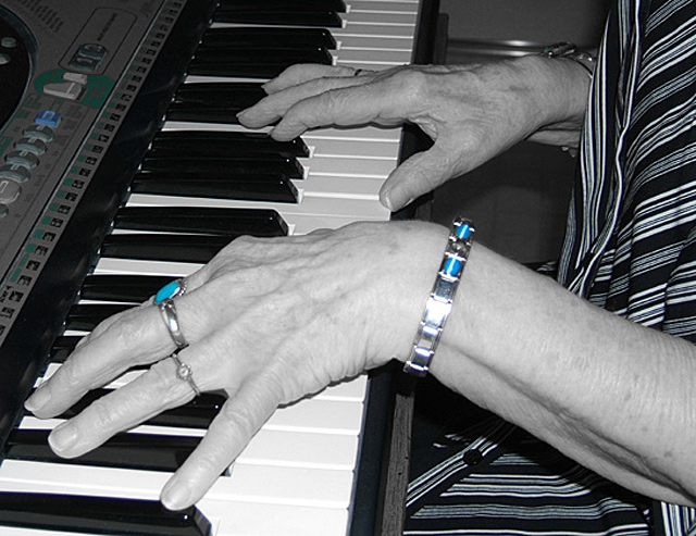
Sorry, can't stand that selective D-sat look anymore. And, I'm sorry to say, I don't feel like you make terribly original use of the technique. And just using a technique won't give you high scores on here. I know from my own experience. Try to focus on getting a well composed, nicely lit, sharp picture that makes good use of perspective and DOF and that is at least a little ORIGINAL. This isn't.
No offense, please, I'm just trying to help.
Cheers,
Bruce
PS: gave you a 4 for uninspired but technically sound |
|
|
|
08/20/2005 03:24:31 PM |
| Nice idea. But I find the hue/saturation changes you've applied cause the eye to get drawn to the jewellery and the buttons on the synth. And why a synth? - A real piano would be much nicer for this type of shot. |
|
|
|
08/20/2005 09:58:19 AM |
I do not understand why you want me to look at the blue jewelry...
TC |
|
|
|
08/18/2005 09:35:43 PM |
| good composition. well done. |
|
 Photographer found comment helpful. Photographer found comment helpful. |
|
|
08/18/2005 08:11:49 PM |
| I'm not sure that the de-sat does anything for this photo. |
|
| Photographer found comment helpful. |
|
|
08/18/2005 10:54:22 AM |
| Nice, but the light is a little uneven (close-range flash?). |
|
| Photographer found comment helpful. |
|
|
08/17/2005 06:14:41 PM |
| I don't know what to make of this. It definitely holds my attention. |
|
|
|
08/17/2005 03:59:46 PM |
| I think the flash is the issue here. |
|
| Photographer found comment helpful. |
|
|
08/17/2005 03:19:10 PM |
| blues are too distracting.....feel they take away from the image instead of adding here |
|
|
|
08/17/2005 01:11:46 PM |
| Awwwww. .. reminds me of my mom at the piano! Very emotive for me! Great job! |
|
| Photographer found comment helpful. |
|
|
08/17/2005 12:52:57 PM |
| Not a fan of onboard flash which is not flattering to old hands and gives a shadow next to the hands which makes this look like a snapshot. I can't understand your decision to desaturate except for blue. Why?! |
|
| Photographer found comment helpful. |
|
|
08/17/2005 05:24:19 AM |
| Like the B&W and would have preferred it be that way. The turquoise is distracting. |
|
| Photographer found comment helpful. |
Home -
Challenges -
Community -
League -
Photos -
Cameras -
Lenses -
Learn -
Help -
Terms of Use -
Privacy -
Top ^
DPChallenge, and website content and design, Copyright © 2001-2025 Challenging Technologies, LLC.
All digital photo copyrights belong to the photographers and may not be used without permission.
Current Server Time: 03/13/2025 04:15:39 PM EDT.