| Author | Thread |
Comments Made During the Challenge  |
|
|
08/30/2005 11:19:54 PM |
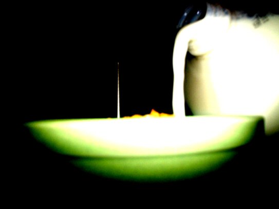
| I don't care for the effect here, it looks grainy and alienish. Also it looks like a needle sticking out of your cereal. |
|
|
|
08/30/2005 10:01:53 PM |
|
|
|
08/30/2005 08:02:47 PM |
| a little to blury and the lighting is off and the background is a little too dark! |
|
|
|
08/30/2005 03:23:47 AM |
| This seems too bright on the bowl and milk container and too dark elsewhere, and is a little too blurry for my taste. What's the white thing sticking up from the bowl? |
|
|
|
08/28/2005 05:06:20 PM |
| Sorry, looks like a bad UFO movie... |
|
|
|
08/28/2005 12:45:36 AM |
| Nice try but I think the Cornflakes could be left out of the bowl. |
|
|
|
08/27/2005 11:30:33 PM |
| This picture is too stark for such a benign subject in my opinion. The light is so concentrated, and the edge of the glass and side of the milk seem blown out. That one spike of milk on the left is interesting, but kinda detracts from the main subject of the milk being poured. Maybe if the title was "Milk Caught In the Act" or something to try to emphasize the caught by police lighting it would have improved the picture for me. |
|
|
|
08/27/2005 12:06:12 AM |
|
|
|
08/25/2005 08:50:06 PM |
| Interesting, not exactly original, and it doesn't really appeal to me. But a nice photo. |
|
|
|
08/25/2005 08:12:58 PM |
|
|
|
08/24/2005 06:42:11 PM |
| Looks like a UFO to me. 5 |
|
|
|
08/24/2005 04:20:14 PM |
|
|
|
08/24/2005 03:31:07 PM |
| very out of focus, colors are very harsh. |
|
|
|
08/24/2005 02:04:21 PM |
| too washed out and blurry |
|
|
|
08/24/2005 07:22:54 AM |
| why submit such an out of focus shot? |
|
|
|
08/24/2005 06:05:39 AM |
|
|
|
08/24/2005 01:06:18 AM |
| Hmm, is that the milk splashing on the side of the bowl or an antenna? Good different perspective going with the dark background. |
|
|
|
08/24/2005 12:44:54 AM |
|
|
|
08/24/2005 12:27:10 AM |
the green tone on the bottom of the bowl is a distracting contrast to the rest of the color tones.....
the white spike that parriles the milks flow is also a distracting pice in this image......
the contrasty highkey affect is very poorly created in this image...the contrast should be brought to a normal level and the color tones worked out then this could have some sort of composition and photo like qoulity to it..........
as it is IMO it is just way to blown out in the subject area and way to dark evey where else.....its just not very good as is. |
|
|
|
08/24/2005 12:16:40 AM |
| The green area is too blown out and blurred to really make any sense. The idea is smart. Maybe work on focus a bit to make it really work. |
|
Home -
Challenges -
Community -
League -
Photos -
Cameras -
Lenses -
Learn -
Help -
Terms of Use -
Privacy -
Top ^
DPChallenge, and website content and design, Copyright © 2001-2025 Challenging Technologies, LLC.
All digital photo copyrights belong to the photographers and may not be used without permission.
Current Server Time: 03/12/2025 12:54:48 PM EDT.