| Author | Thread |
Comments Made During the Challenge  |
|
|
08/28/2005 01:01:47 PM |
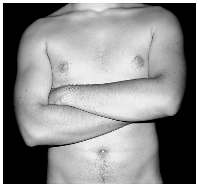
| Nicely framed. Lighting a bit too harsh for my taste but nice picture nevertheless. |
|
 Photographer found comment helpful. Photographer found comment helpful. |
|
|
08/27/2005 08:53:20 PM |
| Highlights appear blown out. If shot in color, Try using channel mixer in PS along with curves to correct this. |
|
| Photographer found comment helpful. |
|
|
08/25/2005 01:44:32 AM |
| Good job. Lighting looks good, title fits. Makes you want to see more. |
|
| Photographer found comment helpful. |
|
|
08/24/2005 02:07:30 AM |
| the subject is well positioned. The lighting seems a little off - the skin is glowing from the flash in a way that detracts from the artistic look you were working towards. |
|
| Photographer found comment helpful. |
|
|
08/23/2005 10:11:23 PM |
| I think a different light setup might have added some dramatic shadows. Focus is good, as is the dof. Good use of black bg to contrast the model. Good job. |
|
| Photographer found comment helpful. |
|
|
08/23/2005 10:09:53 PM |
| Is this the nudie-boy one? :-) A little bit washed out but otherwise a bit more artistic than some of the other photos. |
|
| Photographer found comment helpful. |
|
|
08/23/2005 08:29:56 PM |
| I like the solid black background and choice of pose. For me, I wish there was a bit of chin or a bit more vertical. |
|
| Photographer found comment helpful. |
|
|
08/23/2005 01:36:25 PM |
| Too flat and bright. Could use some toning for depth in post editing. |
|
| Photographer found comment helpful. |
|
|
08/23/2005 01:18:15 PM |
Front on flash is not too good for images like these.
I think the top scorers have put more thought into subtle lighting which emphasizes the contours of the body. |
|
| Photographer found comment helpful. |
|
|
08/23/2005 02:47:36 AM |
|
| Photographer found comment helpful. |
|
|
08/23/2005 12:17:24 AM |
| Your model has good skin tone and looks to be in shape. Imo, I find the picture pretty static and the lighting flat. I don't think I will say anything else. Sorry. |
|
| Photographer found comment helpful. |
|
|
08/22/2005 11:38:35 PM |
| Well done technically, but boring compositionally. 6. |
|
| Photographer found comment helpful. |
|
|
08/22/2005 11:26:52 PM |
| this image is kind of plain. Although technically the light is even and the crop is fine it lacks any emotional connection with the viewer. |
|
| Photographer found comment helpful. |
|
|
08/22/2005 11:03:32 PM |
|
| Photographer found comment helpful. |
|
|
08/22/2005 09:45:03 PM |
| I'm guessing this is a self portrait. A great figure study, I just feel that the pose closes you off a bit. I think something else added into it to create some additional interest could have worked as well. |
|
| Photographer found comment helpful. |
|
|
08/22/2005 09:32:25 PM |
| The way the arms are makes me feel that it is crooked. I do not like the lighting. Looks like you used flash. I am not so sure this is what the had in mind.LOL Good luck |
|
| Photographer found comment helpful. |
|
|
08/22/2005 09:02:29 PM |
| A little hot and a little too centered. |
|
| Photographer found comment helpful. |
|
|
08/22/2005 05:19:53 PM |
| The lighting is good (maybe just a touch too bright)... I'm just not sure about the pose |
|
| Photographer found comment helpful. |
|
|
08/22/2005 06:35:12 AM |
| nice B&W, hope it does well for you. great focus and comp. |
|
| Photographer found comment helpful. |
|
|
08/22/2005 06:04:02 AM |
| Probably just me, but the slanted shoulders and arms breaks the symmetry and it kinda distracts me. |
|
| Photographer found comment helpful. |
|
|
08/22/2005 05:58:40 AM |
| Cut off at the waist and the neck. Two joints cut off, how awkward. |
|
| Photographer found comment helpful. |
|
|
08/22/2005 02:53:32 AM |
| Ok composition and framing, but harsh lighting hurts this. Valiant effort though. |
|
| Photographer found comment helpful. |
|
|
08/22/2005 12:51:21 AM |
| Maybe a touch more contrast. I like the folded arms. Creates and cris cross effect! |
|
| Photographer found comment helpful. |
|
|
08/22/2005 12:49:38 AM |
| blown out highlights from lighting (flash used?) are obvious and stand out. My only other comment is that you seem to have actively tried to keep this a very annonymous entry by cropping the shot at the neck... usually such a crop is always a bit wierd. |
|
| Photographer found comment helpful. |
Home -
Challenges -
Community -
League -
Photos -
Cameras -
Lenses -
Learn -
Help -
Terms of Use -
Privacy -
Top ^
DPChallenge, and website content and design, Copyright © 2001-2025 Challenging Technologies, LLC.
All digital photo copyrights belong to the photographers and may not be used without permission.
Current Server Time: 03/13/2025 08:38:58 AM EDT.