| Author | Thread |
Comments Made During the Challenge  |
|
|
08/30/2005 02:34:49 PM |
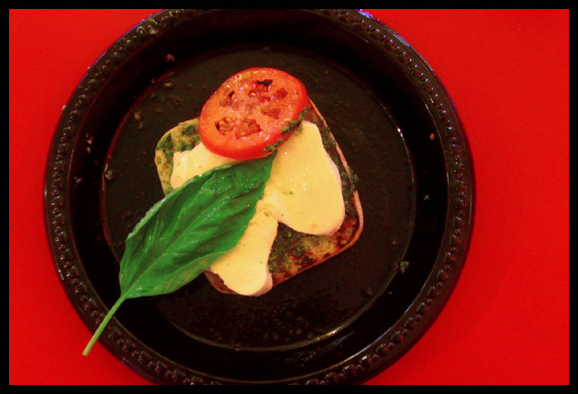
| Lovely. :) The red is a little too much, for me.. but I still like this. |
|
 Photographer found comment helpful. Photographer found comment helpful. |
|
|
08/30/2005 02:01:06 AM |
| IMHO the red background really detracts from the food and does not make it look appetizing. 6 |
|
| Photographer found comment helpful. |
|
|
08/29/2005 08:29:49 PM |
|
|
|
08/28/2005 12:34:47 AM |
| Composition is good but I would have preferred a cleaner plate. |
|
| Photographer found comment helpful. |
|
|
08/25/2005 11:14:24 PM |
| Yummy. Very nice picture, and I like the colors. |
|
|
|
08/25/2005 08:17:37 PM |
| I wish you didn't have such a harsh background. I like the colors of the foods. I wish you would have captured this photo closer. |
|
| Photographer found comment helpful. |
|
|
08/25/2005 04:52:54 PM |
| excellence collage of color. |
|
|
|
08/24/2005 11:25:36 PM |
| Focus isn't that great..Red background is a bit too overpowering. |
|
| Photographer found comment helpful. |
|
|
08/24/2005 09:42:36 PM |
| A tighter crop, slightly better focus, and slight color adjustments would really make this shot awesome. I like the red background and the black plate -- good contrast. |
|
| Photographer found comment helpful. |
|
|
08/24/2005 09:21:00 PM |
| The red background really stands out and overshadows the plate slightly (for me) I like how you off-centered the plate though. Nice job. |
|
| Photographer found comment helpful. |
|
|
08/24/2005 08:38:53 PM |
| I think this could have been better without the plastic looking plate...next time try using a finer china. |
|
|
|
08/24/2005 08:22:00 PM |
| almost but the image is slightly out of fucus to my eye. |
|
| Photographer found comment helpful. |
|
|
08/24/2005 08:35:41 AM |
| Needs to be lit better, poor choice of color for the plate, its like the food is sitting on top of a black hole. Also looks a bit out of focus. |
|
| Photographer found comment helpful. |
|
|
08/24/2005 07:50:43 AM |
|
| Photographer found comment helpful. |
|
|
08/24/2005 01:52:32 AM |
| m looks tasty but the red around the plate is distracting is distracting |
|
| Photographer found comment helpful. |
|
|
08/24/2005 12:04:42 AM |
| While this is a lovely idea (and yummy!) the black plate that looks like one of those disposable ones is a bit for me, as is the extra bits all over it. This would be much stronger if it was a bit crisper and centered a bit more (IMO), but I love the colors! |
|
Home -
Challenges -
Community -
League -
Photos -
Cameras -
Lenses -
Learn -
Help -
Terms of Use -
Privacy -
Top ^
DPChallenge, and website content and design, Copyright © 2001-2025 Challenging Technologies, LLC.
All digital photo copyrights belong to the photographers and may not be used without permission.
Current Server Time: 03/12/2025 02:44:42 PM EDT.