| Author | Thread |
|
|
08/31/2005 04:11:36 AM |
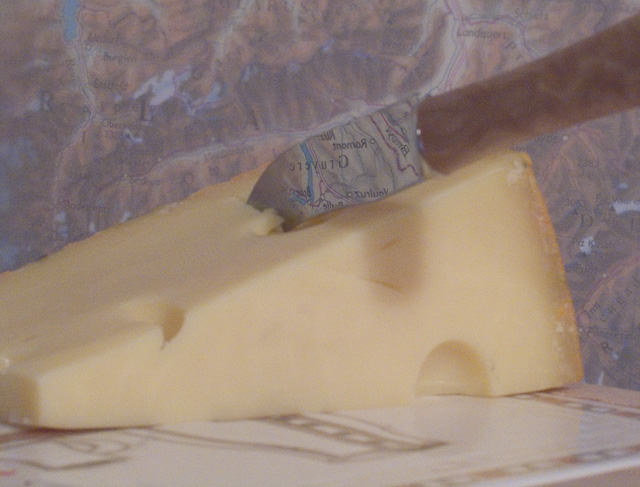
Thanks for your comments guys, I realy apreciate it.
In retrospect I'm pretty pleased with this even if it scored badly. I'm still a newbe and I think I've learned a lot, particularly that I'm realy **** at lighting; something that would have improved this picture a lot.
Clearly the thing to work on is lighting, particularly to bring out contrast and focus the eye on a specific item. Perhaps a different take would be for light reflected of the knife to light up Gruyere, maybe I'll experiment. Any excuse to buy more cheese ;-) |
|
Comments Made During the Challenge  |
|
|
08/30/2005 10:14:28 PM |
| I attempted to do something like this for a challenge a while ago back, but abandoned the effort because I couldn't quite get it right, so I know this is somewhat difficult - you did a great job pulling this off. I think a different background would have made this a more eye-catching image, because as it is, the region in the knife is kind of lost amidst the background map. |
|
|
|
08/30/2005 08:22:20 PM |
| I love the reflection on the knife and the cheese looks really nice |
|
|
|
08/30/2005 03:14:09 PM |
| The Swiss map makes a decent background, but the reflection of Gruyere in the knife was fantastic, too bad one of them had to be inverted. Picture could have been a little sharper and had a bit more contrast. |
|
|
|
08/30/2005 02:29:11 PM |
| Love this shot - the reflection of the map with Switzerland in the knife only improves it, and shows the thought put into it. I gave this a 9. :) |
|
|
|
08/29/2005 05:44:00 PM |
|
|
|
08/29/2005 02:03:00 PM |
| Could be my old eyes are failing,but it seems out of focus... |
|
|
|
08/29/2005 01:20:01 PM |
| Well done! Many won't get it though. Also, I think the cheese board pattern is distracting. |
|
|
|
08/28/2005 11:46:22 AM |
| creative shot although i find the lighting a bit flat. |
|
|
|
08/28/2005 06:56:09 AM |
| Finally! An image with some thought behind it. Such a clever idea and such a welcome relief! 9 |
|
|
|
08/27/2005 02:46:42 PM |
| I really like this, the reflection is well executed; maybe a bit more contrast would make it look better. |
|
|
|
08/27/2005 12:46:45 PM |
| That took some thought. Very clever. |
|
|
|
08/26/2005 07:40:07 PM |
| Reflection is a really nice touch. |
|
|
|
08/26/2005 05:08:23 PM |
| i love that you refleted a region map on the kniife. Uping the saturation would have goiven this pohoto a bit more oomph;. The concept however, is excellent! |
|
|
|
08/25/2005 09:35:10 PM |
| nice shot seems a little fuzzy to me though |
|
|
|
08/25/2005 09:10:21 PM |
| I didn't like this picture that much. It kind of seemed like the cheese was sort of wrapped up in some sort of package. I don't like how the reflection appears in the knife it makes it kind of hard to tell the knife is really a knife. |
|
|
|
08/25/2005 09:00:14 PM |
| I didn't love this picture because the handle looks like it's part of the background. Are you trying to make a certain place on the knife reflect? Intresting.. |
|
|
|
08/25/2005 08:19:25 PM |
| There's a little too much noise and it wouldn't hurt for the picture to be sharper. I don't understand the whole reflecting map thing but it's interesting. I think your knife is upside down. |
|
|
|
08/25/2005 07:26:11 PM |
| This concept and pic is just so neat! Neads a tad more clarity or fade correction to it though. |
|
|
|
08/25/2005 10:27:17 AM |
| i like the reflection in the cheese knife. |
|
|
|
08/24/2005 08:53:24 PM |
| Great work with the reflection of the blade. This works well even in the color tones. |
|
|
|
08/24/2005 08:34:10 PM |
|
|
|
08/24/2005 08:20:12 PM |
| I like the map background and shadow on the knife. Good composition. If the cheese had been a bit crisper or a bit more contrast (brighter?) I would have scored it higher. |
|
|
|
08/24/2005 10:56:19 AM |
| Interesting. I dont see how the map image relates, I think it would have strengthened the composition for me if it did. |
|
|
|
08/24/2005 09:35:54 AM |
| Very grainy, can't really figure out what I'm seeing. |
|
|
|
08/24/2005 05:54:16 AM |
| very witty. would have been a lot better i think with less going on, such as the out of focus table mat and the background. less is more, yes? |
|
|
|
08/24/2005 01:00:20 AM |
| Great idea with the map reflection. 9 |
|
Home -
Challenges -
Community -
League -
Photos -
Cameras -
Lenses -
Learn -
Help -
Terms of Use -
Privacy -
Top ^
DPChallenge, and website content and design, Copyright © 2001-2025 Challenging Technologies, LLC.
All digital photo copyrights belong to the photographers and may not be used without permission.
Current Server Time: 03/12/2025 06:48:48 PM EDT.