| Author | Thread |
|
|
09/05/2005 09:48:42 PM |
| too high of contrast..burns the pupils a bit. |
|
 Photographer found comment helpful. Photographer found comment helpful. |
Comments Made During the Challenge  |
|
|
08/30/2005 11:22:01 PM |
| There's a date on your photo! I thought that was a big no-no around here. |
|
|
|
08/30/2005 11:16:42 PM |
| ?????????????????????????????? |
|
|
|
08/30/2005 02:32:13 PM |
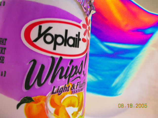
| Not sure what the color in the background is.. but honestly the date kills it for me. |
|
|
|
08/27/2005 11:51:36 PM |
| This would make a good advertisement picture, but, I think the picture would have fit the title better if you would have made the rainbow with more colors of yogurt instead of just a rainbow behind it. The border between the yogurt and the background makes it look blue-screened in place. Also, the date in the bottom right pulls you out of the picture completely. |
|
| Photographer found comment helpful. |
|
|
08/27/2005 12:29:03 PM |
| Stick around this site. You'll get lots of good advice. |
|
| Photographer found comment helpful. |
|
|
08/26/2005 07:41:11 PM |
| Love all the color. Nice cheerful image. |
|
| Photographer found comment helpful. |
|
|
08/26/2005 10:56:33 AM |
|
|
|
08/25/2005 06:15:33 PM |
| Date stamp killed you, liked otherwise! |
|
| Photographer found comment helpful. |
|
|
08/25/2005 09:18:38 AM |
|
|
|
08/24/2005 10:26:48 PM |
| nice bright colors...focus is a bit soft. Need to remove the date from the photo! Very distracting |
|
| Photographer found comment helpful. |
|
|
08/24/2005 10:20:39 PM |
|
|
|
08/24/2005 09:24:25 PM |
| I find the date on the photo and the upper right a bit distracting, but I like how you have the subject off to the side and not dead center. |
|
| Photographer found comment helpful. |
|
|
08/24/2005 09:16:30 PM |
| Not sure what to make of the "rainbow". |
|
|
|
08/24/2005 08:59:27 PM |
| dear lord get rid of that datestamp |
|
|
|
08/24/2005 08:48:26 PM |
| the time stanp in the lower right corner is not a good thing. |
|
|
|
08/24/2005 08:09:40 PM |
| So how many comments on the date? But other then that neat shot. I'd crop a little more off the left - get rid of the tail end of the words. |
|
| Photographer found comment helpful. |
|
|
08/24/2005 04:32:53 PM |
| Not really focused and uninteresting |
|
|
|
08/24/2005 01:11:43 PM |
| I like the colors and the abstract feel to this picture. Could use a little better focus in the foreground. I probably would have cropped out part of the left side where the packaging information is written. Sadly, the time stamp is really going to kill you on scores. Make sure you turn that off on your camera next time. You have a nice eye...keep submitting. |
|
| Photographer found comment helpful. |
|
|
08/24/2005 09:27:22 AM |
| i really hate date-stamps in a picture. Sorry! |
|
|
|
08/24/2005 08:36:26 AM |
| Image date distracts viewer away from rest of the image. |
|
|
|
08/24/2005 06:19:45 AM |
|
Home -
Challenges -
Community -
League -
Photos -
Cameras -
Lenses -
Learn -
Help -
Terms of Use -
Privacy -
Top ^
DPChallenge, and website content and design, Copyright © 2001-2025 Challenging Technologies, LLC.
All digital photo copyrights belong to the photographers and may not be used without permission.
Current Server Time: 03/12/2025 01:27:21 AM EDT.