| Author | Thread |
|
|
09/06/2005 05:14:47 AM |
Greetings from the Critique Club.
Composition:
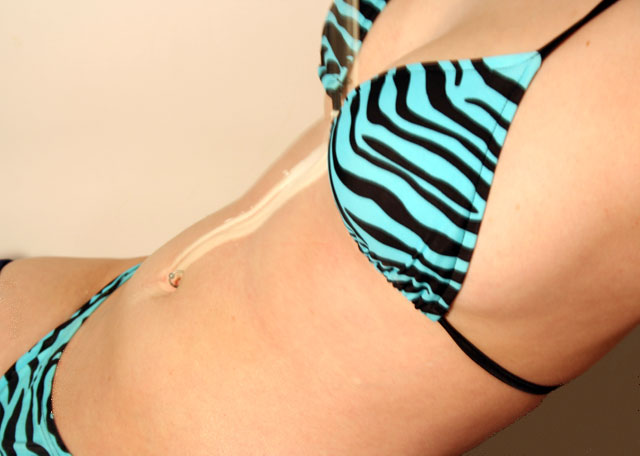
The composition is good, the placement of the model in the frame accentuates the midsection which I am assuming was your intention since that is where the milk is.
Background:
I don't think this background color works because it is to close to the model's skin color. Perhaps something darker would have worked better, it would have given the picture a bit more overall contrast.
My opinion:
To be honest, this picture doesn't really do much for me. To me, it doesn't really meet the challenge. I think that if you had used the theme "milk" in a bit more obvious way, this would have done better.
If you have any questions or comments about this critique please feel free to PM me.
June
|
|
Comments Made During the Challenge  |
|
|
08/30/2005 08:05:16 PM |
| I can not really see the milk and I am distratced by the zebra stripes |
|
|
|
08/30/2005 02:05:14 PM |
| Is that milk running down her stomach? Can't quite figure it out.. not super crazy about this one, and it all looks slightly blurry. |
|
|
|
08/29/2005 11:48:55 PM |
| Apparently milk does a lot of bodies good. |
|
|
|
08/27/2005 01:01:20 PM |
Fit Challenge Criteria: 0/2
Contrast/Color: 1/2
Composition: 1/2
Photo Quality: 1/2
My Subjective Affinity: 0/2 |
|
|
|
08/26/2005 07:16:35 PM |
| I like the color of the bathing suit. The picture itself is kind of boring. |
|
|
|
08/25/2005 10:01:22 PM |
| i wish that the milk would have been a bit more visible. Seeing more of the milk actually spilling/pouring would have been nice to. Too bad there wasnt more of a difference of color between the body and the background. |
|
|
|
08/25/2005 08:25:49 PM |
| I get how it's kind of dairy-related (because of the title) but I don't find it interesting. It's a little creative but if there was maybe a little more dairy, or if it fit more I would've scored higher. |
|
|
|
08/25/2005 08:19:59 PM |
| There's hardly any dairy in this photo and I don't like how you had a person wearing a bikini |
|
|
|
08/25/2005 08:17:03 PM |
| Your milk looks like sun screen and all the colors are blending except for the blue and black. |
|
|
|
08/25/2005 08:03:13 PM |
| the model is nice, but the milk just looks ike light |
|
|
|
08/25/2005 03:04:49 PM |
| Uhm, is that milk going down the front of her? Not very clear on what your focus is. |
|
|
|
08/25/2005 10:15:19 AM |
|
|
|
08/24/2005 09:24:41 PM |
| Looks like a problem tanning, more than milk. |
|
|
|
08/24/2005 03:41:17 AM |
|
|
|
08/24/2005 12:34:49 AM |
| Great idea, needs more milk |
|
Home -
Challenges -
Community -
League -
Photos -
Cameras -
Lenses -
Learn -
Help -
Terms of Use -
Privacy -
Top ^
DPChallenge, and website content and design, Copyright © 2001-2025 Challenging Technologies, LLC.
All digital photo copyrights belong to the photographers and may not be used without permission.
Current Server Time: 03/12/2025 10:01:09 AM EDT.