| Author | Thread |
|
|
06/05/2003 05:00:01 PM |
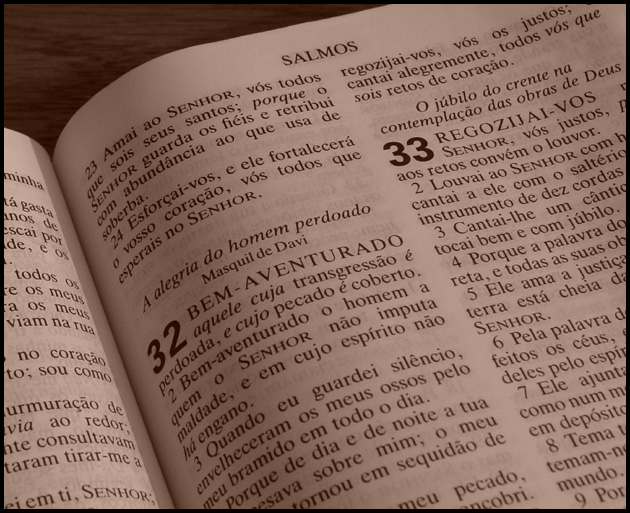
| I'm just looking back at the photos I rated highly and wondering what this is doing back here. Did you go to Brazil on a mission? |
|
 Photographer found comment helpful. Photographer found comment helpful. |
Comments Made During the Challenge  |
|
|
06/01/2003 04:31:51 PM |
| Great lighting and focus. Sometimes it helps the interest level if the subject (in this case a Bible) in a more contextual setting. This seems especially true of books. I think it may have helped here to give teh viewer a sense of looking at more than just a book. |
|
| Photographer found comment helpful. |
|
|
06/01/2003 04:31:21 AM |
| Interesting...Sepia.. nice and clear..no transgressions here |
|
| Photographer found comment helpful. |
|
|
05/31/2003 02:27:28 AM |
Interessando. Um livro é naturalmente preto e branco -- por que adicione um tom do 'sepia'?
And now, for the Portuguese impaired (I can only do it with help): Interesting. A book is naturally black and white -- why add a sepia tone?
In any event, I do think a book is a natural choice for this, so definitely interesting, and a good shot of it. |
|
| Photographer found comment helpful. |
|
|
05/27/2003 10:52:46 PM |
| It looks like mine, A little plain. Sorry. Mine is too... |
|
| Photographer found comment helpful. |
|
|
05/26/2003 03:48:09 PM |
| I like the lighting that ended up on the left page, seems to bring out the type a bit better. Not sure what color the pages are, but a tad brighter may add more pop to the text |
|
| Photographer found comment helpful. |
|
|
05/26/2003 01:35:45 AM |
| Need less red tone in it I think. Not enough white tones in it. |
|
| Photographer found comment helpful. |
Home -
Challenges -
Community -
League -
Photos -
Cameras -
Lenses -
Learn -
Help -
Terms of Use -
Privacy -
Top ^
DPChallenge, and website content and design, Copyright © 2001-2025 Challenging Technologies, LLC.
All digital photo copyrights belong to the photographers and may not be used without permission.
Current Server Time: 03/12/2025 07:43:06 AM EDT.