| Author | Thread |
|
|
09/07/2005 05:41:37 AM |
Hmm... nobody understands what I'm doing or what the title means...
AHA! I'M AN ARTIST!
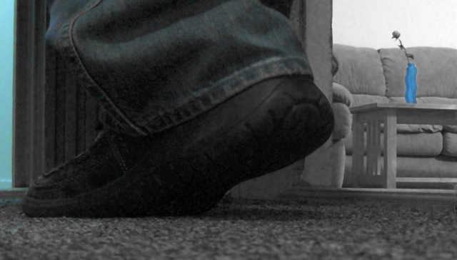
Actually, I agree. This is a shit picture--taken at the last minute and using an idea that I just couldn't get to work right. I was trying to use the hallway lights just outside my apartment door, which were directly overhead, hence the shoe in shadow. My camera was placed on it's end on the floor and propped up with a few books I had. I desaturated everything except the vase because the picture was so underexposed that the colors looked bad no matter what I did. I left the vase blue so it wouldn't be lost in the background (important because it's the only interesting thing in the picture).
The title comes from the Bob Dylan song "Don't Think Twice (It's Alright)" about a guy walking away from a relationship and I was trying to capture that here. Unfortunately, even before I submitted it I knew this was going straight to the bottom of the rankings (Lots of comments, though, thanks for putting up with this crap!).
Funny that of my six challenge submissions, my first three were the best (average score: 5.682) and my latest three have all been rather bad (average score: 4.29). I guess I haven't been inspired as of late (by the challenges at least, next week I'm picking up some enlargements of my own photos and hanging them on my walls).
Here's hoping for next week. *pours another pint*
By the way, how does one edit their comments next to the photo information after a challenge is over? |
|
Comments Made During the Challenge  |
|
|
09/06/2005 11:57:29 PM |
|
 Photographer found comment helpful. Photographer found comment helpful. |
|
|
09/06/2005 11:52:32 PM |
| the subject is in the shoe right? but the blues distract me and u keep looking at the vase |
|
| Photographer found comment helpful. |
|
|
09/06/2005 02:56:20 PM |
|
|
|
09/06/2005 12:48:35 AM |
| clever title. the blue thing is very distracting. |
|
| Photographer found comment helpful. |
|
|
09/05/2005 11:16:23 PM |
| What's the significance of the blue? The shoe seems to be the least important part of the image. Also, there is too much noise. |
|
| Photographer found comment helpful. |
|
|
09/05/2005 07:48:31 PM |
| why the color in the vase in the background. I think it is distracting from the subject and doesn't bring the focus to something interesting going on in the background |
|
| Photographer found comment helpful. |
|
|
09/05/2005 06:51:10 PM |
|
|
|
09/05/2005 12:40:51 PM |
Fit Challenge Criteria: 0/2
Color/Contrast: 0/2
Composition: 0/2
Photo Quality: 1/2
My Subjective Affinity: 0/2
Photo is too dark, with lack of contrast. Only focus point the the blue vase, and the shoe is barely visible. The setting appears to have been more of a snapshot that really thought out. |
|
| Photographer found comment helpful. |
|
|
09/04/2005 07:07:45 PM |
| Interesting angle, the vase took away from the image for me. |
|
| Photographer found comment helpful. |
|
|
09/04/2005 03:36:18 PM |
| everything about this photo tells my eye to look in the room, past your main subject. The light and saturated vase pull my eye right in. If that was your intent, excellent job, but it doesn't work for me. |
|
| Photographer found comment helpful. |
|
|
09/04/2005 09:38:36 AM |
| poor lighting - the selective desat does nothing to help by highlighting the vase and the wall leaving the shoes to disappear into the pic |
|
| Photographer found comment helpful. |
|
|
09/03/2005 10:39:09 PM |
Love the vase! :)
Good luck! :) |
|
|
|
09/02/2005 12:12:59 PM |
| shoes was the challenge, this is hardly visible |
|
|
|
09/01/2005 08:13:55 PM |
| There are no details in the shadows, and the shoe seems to be almost completely in shadow. I do not understand the title or the relvance of the blue vase on the table - thought there must be one, or why else would you have drawn the attention away from the challenge defined subject matter the shoe, and onto the vase? Feel free to PM and explain. |
|
| Photographer found comment helpful. |
|
|
09/01/2005 06:02:24 PM |
| humm blue vase looks out of place |
|
|
|
09/01/2005 04:50:33 PM |
| too blurry and grainy--a border could have tied in the photo and made it more interesting |
|
| Photographer found comment helpful. |
|
|
09/01/2005 04:35:01 PM |
| I'm not convinced this falls into the basic editing catagory. I could be wrong but it looks like you may have done some 'spot editing' to regain the colour (blue areas) |
|
|
|
09/01/2005 01:20:16 PM |
| I can see all the dots in the photo and the blue door and vase distract me! |
|
| Photographer found comment helpful. |
|
|
09/01/2005 09:31:40 AM |
| Image seems a bit fuzzy and grainy. I also woul dhave liked to see the show a bit more from the side. Also I am not really sure what the point of selective desat is of all but blue in this picture. |
|
| Photographer found comment helpful. |
|
|
08/31/2005 08:39:38 PM |
| I don't get the title. I like how the vase is blue but everything else is greyish. A bit overdone, however. Focus off and noisy. |
|
| Photographer found comment helpful. |
Home -
Challenges -
Community -
League -
Photos -
Cameras -
Lenses -
Learn -
Help -
Terms of Use -
Privacy -
Top ^
DPChallenge, and website content and design, Copyright © 2001-2025 Challenging Technologies, LLC.
All digital photo copyrights belong to the photographers and may not be used without permission.
Current Server Time: 03/14/2025 09:33:27 AM EDT.