| Author | Thread |
|
|
09/09/2005 07:54:21 AM |
| I can't believe this was not amongst top 10. I loved this one though I would have liked stronger contrast. |
|
 Photographer found comment helpful. Photographer found comment helpful. |
|
|
09/07/2005 12:59:28 AM |
| Wish I'd seen this one during voting, it's so hard to do high-key just right like this. Of course you proved your mastery of the subject with your fabulous "Where's Waldo" photo! |
|
| Photographer found comment helpful. |
Comments Made During the Challenge  |
|
|
09/06/2005 10:46:48 PM |
| nice idea... perhaps a little too subtle for me... but well done |
|
| Photographer found comment helpful. |
|
|
09/06/2005 08:31:24 PM |
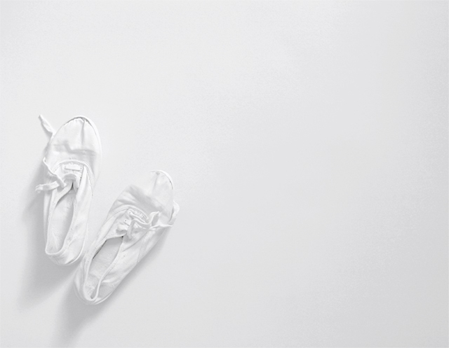
| I really like this, you make the white stand out with your lighting even though it is all white, most people couldn't pull this off. Great job. |
|
| Photographer found comment helpful. |
|
|
09/06/2005 08:52:48 AM |
| I really like this. Simple, Stark and Striking. Nice. |
|
| Photographer found comment helpful. |
|
|
09/05/2005 11:08:04 PM |
| A nudge more use of shadow to bring more emphasis on the detail of the shoes. Nice idea |
|
| Photographer found comment helpful. |
|
|
09/05/2005 04:32:00 PM |
| Very original! lovely use of "color"! You seem to have a very creative mind. Keep it up. |
|
| Photographer found comment helpful. |
|
|
09/05/2005 12:42:54 PM |
Fit Challenge Criteria: 2/2
Color/Contrast: 1/2
Composition: 2/2
Photo Quality: 1/2
My Subjective Affinity: 1/2
I don't know what it is about the shots that have tons of empty white/dark space but I really like them. Nice work. Only major complaint is that the shoes are a little too lost in the whiteness. |
|
| Photographer found comment helpful. |
|
|
09/05/2005 03:56:32 AM |
| I thought the fact that I could see the shoes was great. I love the composition. |
|
| Photographer found comment helpful. |
|
|
09/04/2005 06:57:50 PM |
| White-on-white works brilliantly here. Its not easy to do. If the theory about composition (see tutorial) is true, then the shoes in the right hand corner would be more powerful - and maybe worth an extra point, who knows - 7 |
|
| Photographer found comment helpful. |
|
|
09/04/2005 05:48:10 PM |
| After looking at all of the pictures, I am reassessing...enioy it. But no tenis show I every had came through it that white. |
|
| Photographer found comment helpful. |
|
|
09/04/2005 06:02:25 AM |
| This is very nice. I love the use of negative space. Good Job! |
|
| Photographer found comment helpful. |
|
|
09/03/2005 09:54:31 PM |
| High key to it's best, great detail lovely composition! Good luck ;-) |
|
| Photographer found comment helpful. |
|
|
09/01/2005 05:07:12 PM |
| Nice idea, works well, good use of neg. space. |
|
| Photographer found comment helpful. |
|
|
09/01/2005 01:15:26 PM |
| It is hard to tell where the shoes are but I love the originality. |
|
| Photographer found comment helpful. |
|
|
09/01/2005 11:49:44 AM |
| Dreamy and fluffy. I think pink toe shoes, or a different backround color might? have worked also. |
|
| Photographer found comment helpful. |
|
|
08/31/2005 10:57:59 PM |
| A cool minimalist effect! I like it alot---very good lighting too |
|
| Photographer found comment helpful. |
|
|
08/31/2005 08:34:40 PM |
| I like how you used the rule of thirds. I also like how you did white on white. |
|
| Photographer found comment helpful. |
|
|
08/31/2005 08:14:53 PM |
| To much white for my choice. No defining colors. I do like how the shoe laces are not tied and are laying on the side of the shoe. Border helps. Maybe some color next time?! |
|
| Photographer found comment helpful. |
|
|
08/31/2005 07:54:04 PM |
| simple, effective. well executed |
|
| Photographer found comment helpful. |
|
|
08/31/2005 05:02:30 PM |
|
| Photographer found comment helpful. |
|
|
08/31/2005 04:39:09 PM |
| Shoe minimalism ..... I like it! |
|
| Photographer found comment helpful. |
|
|
08/31/2005 02:29:52 PM |
|
| Photographer found comment helpful. |
|
|
08/31/2005 09:56:36 AM |
| Great monochromatic theme. Looks like a piece of modern art in a gallery. I like it. Subtle with it's lack of color. 9 |
|
| Photographer found comment helpful. |
|
|
08/31/2005 08:26:39 AM |
| i like it, amazing one, i really like it |
|
| Photographer found comment helpful. |
|
|
08/31/2005 08:10:01 AM |
| I love minimalism. Maybe little strong contrast would have helped.9. |
|
| Photographer found comment helpful. |
|
|
08/31/2005 07:19:39 AM |
|
| Photographer found comment helpful. |
|
|
08/31/2005 04:53:44 AM |
| well created image, maybe a little more contrast needed? but then that's only a personal choice - good luck |
|
| Photographer found comment helpful. |
|
|
08/31/2005 03:48:09 AM |
| High key shot dreamy maybe detais should have come in little stronger. but lcks an idea |
|
| Photographer found comment helpful. |
|
|
08/31/2005 03:27:08 AM |
| Great highkey image! A frame would be great here so that the viewer's eye doesn't leave the image frame. 7 |
|
| Photographer found comment helpful. |
Home -
Challenges -
Community -
League -
Photos -
Cameras -
Lenses -
Learn -
Help -
Terms of Use -
Privacy -
Top ^
DPChallenge, and website content and design, Copyright © 2001-2025 Challenging Technologies, LLC.
All digital photo copyrights belong to the photographers and may not be used without permission.
Current Server Time: 03/12/2025 07:31:38 AM EDT.