| Author | Thread |
Comments Made During the Challenge  |
|
|
09/06/2005 11:14:01 PM |
| Don't know about the odd angle, but I like the idea. It looks like a group of cheerleaders. |
|
 Photographer found comment helpful. Photographer found comment helpful. |
|
|
09/03/2005 11:42:54 PM |
| sorry the tilted pic doesnt work for me |
|
| Photographer found comment helpful. |
|
|
09/03/2005 11:43:20 AM |
| why the uninteresting frame. It just is distracting to me |
|
| Photographer found comment helpful. |
|
|
09/03/2005 08:13:09 AM |
| You put the effort into this which is great. |
|
| Photographer found comment helpful. |
|
|
09/02/2005 12:21:42 AM |
| I'd recomend rotating the photo before cropping it, Dont want to come off rude but kind of a boring setup. |
|
| Photographer found comment helpful. |
|
|
09/01/2005 07:37:47 PM |
| I like the way you have only certain parts colored and I also like the black and white thing going on. Good luck. |
|
| Photographer found comment helpful. |
|
|
09/01/2005 04:37:00 PM |
| the way the image is tilted in frame makes lit look like it was a scanned photo. |
|
| Photographer found comment helpful. |
|
|
09/01/2005 01:38:48 PM |
| I like the selective desat. The way you chose to present this image has harmed your overall score. The roated boarder is not appealing to the eye. You would have been better off to have cropped the image. |
|
| Photographer found comment helpful. |
|
|
09/01/2005 06:41:19 AM |
| I like the desaturation, but maybe a crop after the slight rotation would have omitted the border which is completely distracting. Has potential. |
|
| Photographer found comment helpful. |
|
|
08/31/2005 11:04:16 PM |
| Sorry to be blunt, but selective desaturation and a gimmicky frame are not going to improve a photo unless it's really bold and interesting to begin with. |
|
| Photographer found comment helpful. |
|
|
08/31/2005 08:14:06 PM |
| Cool Idea! I like the originality |
|
| Photographer found comment helpful. |
|
|
08/31/2005 04:09:34 PM |
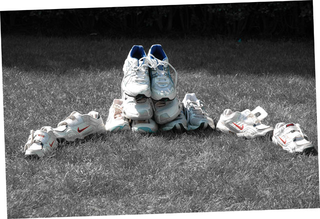
| Sorry but not at all a fan of the frame, normally I don´t comment on them at all but this one just so firmly grasps at my attention that it took me a second to notice the shot itself and to be honest I don´t care for it at all. I feel the the shot itself is slightly worse than average in this challenge, the alignment of the shoes is kind of interesting but the lighting is poor, the shadow in the back is too dark and big parts of the shoes have blown out highlights. 3 from me, would have given 4 if it weren´t for the frame. |
|
| Photographer found comment helpful. |
|
|
08/31/2005 01:10:22 PM |
| The skewed frame does nothing for the picture at all, and doesn't relate to it in any way. The lighting is odd with the line of sunlight across the top of the picture. Nothing is in focus. The theme seems uninspiring, it's a crescent shape alright, but that's all it is, just like an untidy pile of kids trainers on your lawn. |
|
| Photographer found comment helpful. |
Home -
Challenges -
Community -
League -
Photos -
Cameras -
Lenses -
Learn -
Help -
Terms of Use -
Privacy -
Top ^
DPChallenge, and website content and design, Copyright © 2001-2025 Challenging Technologies, LLC.
All digital photo copyrights belong to the photographers and may not be used without permission.
Current Server Time: 03/14/2025 06:13:47 AM EDT.