| Author | Thread |
Comments Made During the Challenge  |
|
|
09/06/2005 11:10:02 AM |
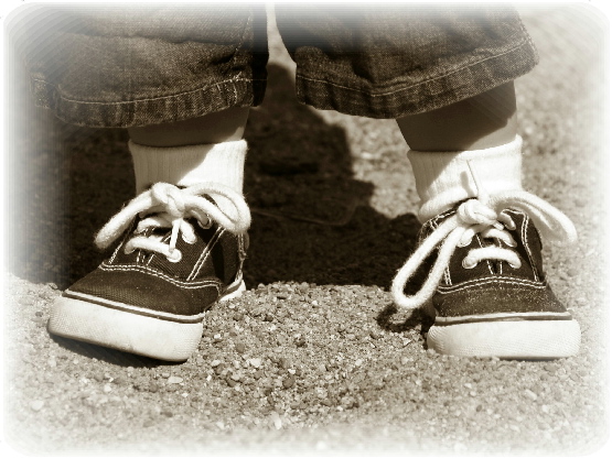
| This is sweet. I don't know that you needed the white soft frame, I believe they would ahve stood well on their own with the color you chose. |
|
|
|
09/05/2005 07:10:26 PM |
| What a sweet image. Nice composition, your subjects little legs are so cute. lIke the effect around the image. |
|
|
|
09/04/2005 10:17:44 PM |
| I like the choice of border, very old fashioned looking. But I think the kids feet are too close to the border, if they had been just an inch closer together, they would be threatened by the border like they are. |
|
|
|
09/03/2005 09:10:39 AM |
| I like the border and the B + W. Works great being a little guy! 9 |
|
|
|
09/02/2005 12:21:29 PM |
| look like new shoes, the fading at the edges goes into the right shoe, otherwise nicely done |
|
|
|
09/02/2005 08:12:35 AM |
|
|
|
09/01/2005 10:24:01 PM |
| This picture is adorable. I think the framing adds greatness to it. The little feet are darling and the black and white.. perfection. 10 |
|
|
|
09/01/2005 01:08:27 AM |
| You'll probably get some neg feedback and the edges, but I like it. The shot is clear and I think the edges bring the focus into those precious little legs and shoes. Good job. |
|
|
|
08/31/2005 10:15:28 PM |
| this is very nice and cute, but the white vignetting in the corners is banded and looks very computer generated. |
|
|
|
08/31/2005 08:21:59 PM |
| This is like a vintage early ninteen hundred photo. I LOVE IT! |
|
|
|
08/31/2005 08:17:06 PM |
|
|
|
08/31/2005 08:11:37 PM |
|
|
|
08/31/2005 08:07:49 PM |
| Maybe if you did this at an angle it would have been better?.. |
|
|
|
08/31/2005 06:47:51 PM |
| Very cute! Love the double knots and the bowed legs. |
|
|
|
08/31/2005 02:53:22 PM |
| i like the coloring and feathering you have done to this picture. |
|
|
|
08/31/2005 08:20:04 AM |
| This has an old timey sense to it with the traditional type sneakers, the sepia and the edge fading. I like it. |
|
|
|
08/31/2005 06:53:24 AM |
| Don't like the fade (Is that allowed?). |
|
|
|
08/31/2005 04:50:15 AM |
| well constructed image and I like the treatment, maybe I would have gone for more of a sepia tint? |
|
|
|
08/31/2005 01:09:30 AM |
| maybe you should take a little bit of the inner glow. a little less would make it look better. but overall its a pretty good pic |
|
|
|
08/31/2005 12:30:22 AM |
| In this case, I think the border detracts rather than helps the photo. |
|
Home -
Challenges -
Community -
League -
Photos -
Cameras -
Lenses -
Learn -
Help -
Terms of Use -
Privacy -
Top ^
DPChallenge, and website content and design, Copyright © 2001-2025 Challenging Technologies, LLC.
All digital photo copyrights belong to the photographers and may not be used without permission.
Current Server Time: 03/12/2025 03:21:39 PM EDT.