| Author | Thread |
|
|
09/07/2005 12:23:26 AM |
| Thanks for all the comments;) I can die happy now I've made it to Joey's Favourites list:)) |
|
Comments Made During the Challenge  |
|
|
09/06/2005 09:58:53 PM |
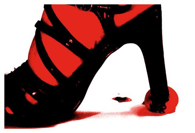
| The extremely processed feel kinda takes away from the image I'm afraid. It adds impact to the shape and composition alright, but the tomato is lost without the title. |
|
 Photographer found comment helpful. Photographer found comment helpful. |
|
|
09/06/2005 12:51:51 PM |
| awesome.love the contrast,love the tomato.love everything.10 |
|
| Photographer found comment helpful. |
|
|
09/05/2005 11:24:08 PM |
| Would probably have done even better in the Contrast challenge! Very cool concept and creative execution - 8 |
|
| Photographer found comment helpful. |
|
|
09/04/2005 06:59:49 PM |
| Great attention getting photo! The red is very dramatic. |
|
| Photographer found comment helpful. |
|
|
09/04/2005 02:05:18 PM |
| i like the rendering of the image, gives a modern art feel well done |
|
| Photographer found comment helpful. |
|
|
09/04/2005 09:55:51 AM |
cruel - save our tomatoes!
looks out of focus - may be due to grain or colour management. |
|
| Photographer found comment helpful. |
|
|
09/03/2005 08:27:56 PM |
I like the idea here - and love the movie - Attack of the Killer Tomatoes
|
|
| Photographer found comment helpful. |
|
|
09/03/2005 03:49:08 PM |
|
| Photographer found comment helpful. |
|
|
09/03/2005 11:39:40 AM |
|
| Photographer found comment helpful. |
|
|
09/03/2005 10:19:14 AM |
|
| Photographer found comment helpful. |
|
|
09/03/2005 07:53:46 AM |
| nice graphic effect--maybe another tomato in this scene would give a stronger message--what do you think? |
|
| Photographer found comment helpful. |
|
|
09/03/2005 03:23:09 AM |
| This is a little harsh for me. I'm trying to figure the context for using the effect and I can't quite tell what is going on under the heal and in the background. |
|
| Photographer found comment helpful. |
|
|
09/02/2005 08:00:08 AM |
| looks like a poster! good job |
|
| Photographer found comment helpful. |
|
|
09/02/2005 04:54:00 AM |
| This works briliantly as a thumbnail but the effects are too extreme in full size |
|
| Photographer found comment helpful. |
|
|
09/01/2005 07:42:39 PM |
| Wow- This image really coveys revenge. especially the red, bloodlike splotch... I do wish that it was a bit less pixelated though. |
|
| Photographer found comment helpful. |
|
|
09/01/2005 01:03:57 PM |
| i would have scored this image a lot higher if it was not for the harsh postprocessing- as it stands it falls into the catagory of digital art rather that photography imho |
|
| Photographer found comment helpful. |
|
|
08/31/2005 08:25:35 PM |
| what? cool coloring but still what? |
|
| Photographer found comment helpful. |
|
|
08/31/2005 08:21:41 PM |
| Interesting idea. I like how the colors are bright and you've used only red, black and white. I think it might've looked better if the picture of the shoe wasn't cut off by white and if it just went to the end of the picture. Very amusing though. |
|
| Photographer found comment helpful. |
|
|
08/31/2005 08:01:25 PM |
| Creepy mate. The red sort of hurts my eyes. I don't know what to make of this photo or the border. White...I don't think it detracts from the image too much, but it doesn't add much either. |
|
| Photographer found comment helpful. |
|
|
08/31/2005 07:53:20 PM |
|
| Photographer found comment helpful. |
|
|
08/31/2005 02:15:53 PM |
| Oh I like this, very pop art like. rating highly |
|
| Photographer found comment helpful. |
|
|
08/31/2005 12:22:47 PM |
| Besides the fact that this looks an an 80s rock album cover, this is a great shot. |
|
| Photographer found comment helpful. |
|
|
08/31/2005 11:17:00 AM |
| Beautiful colors...very vibrant...very creative! Points for all those! |
|
| Photographer found comment helpful. |
|
|
08/31/2005 08:08:32 AM |
| Nice, abstract and different. I like the burnt look.8. |
|
| Photographer found comment helpful. |
|
|
08/31/2005 06:10:02 AM |
| very good; a non-white border may be better |
|
| Photographer found comment helpful. |
|
|
08/31/2005 01:38:29 AM |
| looks like sin city art. too processed to me, but i like the image, not as a photograph just an image. 6 for good image but too much manipulation for a "photography" challenge. |
|
| Photographer found comment helpful. |
Home -
Challenges -
Community -
League -
Photos -
Cameras -
Lenses -
Learn -
Help -
Terms of Use -
Privacy -
Top ^
DPChallenge, and website content and design, Copyright © 2001-2025 Challenging Technologies, LLC.
All digital photo copyrights belong to the photographers and may not be used without permission.
Current Server Time: 03/12/2025 04:04:23 PM EDT.