| Author | Thread |
|
|
09/19/2005 04:21:23 PM |
Greetings from the Critique Club!
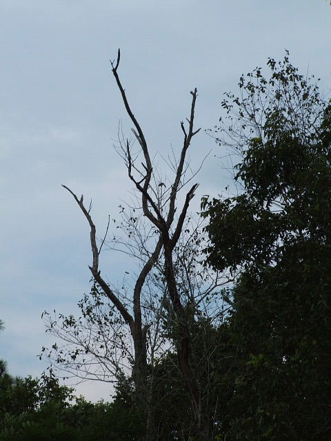
This is a good idea for the challenge, branches against the sky and I like the concept.
The problem that I see are the branches all around it. Maybe if you had zoomed in more on the ones against the sky, leaving out the others? Also the picture does not appear black and white on my monitor but it could be converted quite easily and then adjust the levels or curves to really make the tones come through, or even leave in color and adjust your levels and contrast to help bring out the blue against the black branch.
My thought process is that if you move a bit to your right and take the shot zoomed in more on just the branches in the middle, cutting out the side and bottom and then work on the levels if the lighting is again low, you would have a much more dramatic and wow kind of shot. Maybe even angle it a bit so the branches come in from the side or corner.
I see you have only been here a short time, not sure anyone has said WELCOME yet, so here you go WELCOME TO DPC! I think you will find a great source of help and information here.
Good Luck in future challenges.
Deannda |
|
 Photographer found comment helpful. Photographer found comment helpful. |
Comments Made During the Challenge  |
|
|
09/13/2005 12:55:26 PM |
|
| Photographer found comment helpful. |
|
|
09/12/2005 09:48:06 PM |
| I would like this more if the branches were more to the right in the picture versus being centered |
|
| Photographer found comment helpful. |
|
|
09/12/2005 07:51:19 PM |
| Not very creative, and very dark |
|
| Photographer found comment helpful. |
|
|
09/10/2005 12:32:19 AM |
| Branches don't stick pop out enough. Maybe if they were lit up more or if the sky was brighter. |
|
| Photographer found comment helpful. |
|
|
09/09/2005 08:17:33 PM |
| I wish it wasn't so lush around that lone, straggly tree. |
|
| Photographer found comment helpful. |
|
|
09/09/2005 11:04:43 AM |
| great branches on that dead tree. I can see why you chose the name. Colors seem a bit blah, though. |
|
| Photographer found comment helpful. |
|
|
09/09/2005 01:13:45 AM |
| nice, but would like to see more detail in the trees |
|
| Photographer found comment helpful. |
|
|
09/08/2005 10:13:51 PM |
| Yes, but not a lot of interest here. Maybe different lighting or focus would help. |
|
| Photographer found comment helpful. |
|
|
09/08/2005 04:48:30 PM |
| A little too much like an ordinary snapshot for me. |
|
| Photographer found comment helpful. |
|
|
09/08/2005 04:00:51 PM |
| You have met the challenge topically, but I don't see any other reason to be interested in this image. |
|
| Photographer found comment helpful. |
|
|
09/08/2005 01:09:53 PM |
| composition needs work, subject matter is somewhat uninteresting. i think the tree w/leaves to the right of the subject tree is making the photo too busy |
|
| Photographer found comment helpful. |
|
|
09/07/2005 09:04:05 PM |
| Not a bad photo, but I wonder how if would look if you cropped out more of the trees on the right hand side so that the branches weren't so centered in the picture? |
|
| Photographer found comment helpful. |
|
|
09/07/2005 08:53:59 PM |
| It's just kind of average |
|
| Photographer found comment helpful. |
|
|
09/07/2005 05:40:37 PM |
| Foreground is badly under exposed for a "traditional" picture or the composition is too busy for a silhouette. I'm not sure what you were aiming for here. |
|
| Photographer found comment helpful. |
Home -
Challenges -
Community -
League -
Photos -
Cameras -
Lenses -
Learn -
Help -
Terms of Use -
Privacy -
Top ^
DPChallenge, and website content and design, Copyright © 2001-2025 Challenging Technologies, LLC.
All digital photo copyrights belong to the photographers and may not be used without permission.
Current Server Time: 03/16/2025 07:41:36 PM EDT.