| Author | Thread |
|
|
09/17/2005 09:22:01 PM |
Greetings from the Critique Club:
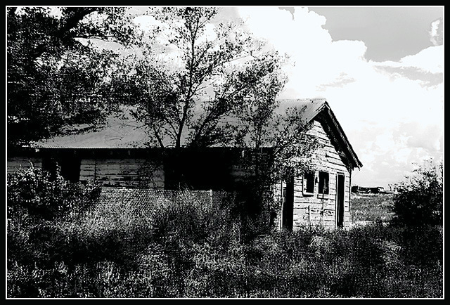
This shot rocks. It's way underrated. I love the contrasts - the composition is great. I think the only thing that hurt this shot was the sky. The clouds almost look inverted and don't look "real" and definitely don't fit the mood of the rest of the picture.
This is a really nice edit - good capture and good finish. Too bad about the not-so-understanding average voter.
happy shooting!
Matt |
|
 Photographer found comment helpful. Photographer found comment helpful. |
Comments Made During the Challenge  |
|
|
09/11/2005 09:22:11 PM |
| Very nice. It is perhaps a bit too high contrast--the clouds have posterized in the background. |
|
|
|
09/11/2005 05:54:13 PM |
| You've definitely created high contrast with a photo-editing program, but the sky seems....overly done, and it seems to border on a pencil type drawing. |
|
|
|
09/10/2005 04:37:26 PM |
| This is a beautiful scene. I'd like to see sharper focus on the front of the house, rather than the upper right clouds. The sky is a bit blown out, which distracts from the rest of the scene. Nice job with the colors. They're subtle and help give a contrasty feel to the image. |
|
|
|
09/10/2005 02:00:31 PM |
| The clouds are a bit distrating but all else fits very nice |
|
|
|
09/10/2005 06:30:18 AM |
| The angle of the horizon is crooked. Perhaps a 1- 2 degree rotation CCW could have helped this. Good luck in this challenge. <7> Would have been 8 or 9 if it were straightened. |
|
|
|
09/10/2005 01:31:49 AM |
| Good black and white contrast. |
|
|
|
09/09/2005 09:59:09 PM |
| I love old buildings. I think I'd like this a bit more if shot from an unusual angle, although this does showcase the doors and windows of the back and the lighting helps with the contrast. |
|
|
|
09/07/2005 08:27:55 PM |
|
|
|
09/05/2005 09:02:50 AM |
No argument on the high contrast.
Too busy for this style perhaps. a simpler subject with fewer lines maybe. |
|
|
|
09/05/2005 12:56:53 AM |
| looks a bit overworked... |
|
Home -
Challenges -
Community -
League -
Photos -
Cameras -
Lenses -
Learn -
Help -
Terms of Use -
Privacy -
Top ^
DPChallenge, and website content and design, Copyright © 2001-2025 Challenging Technologies, LLC.
All digital photo copyrights belong to the photographers and may not be used without permission.
Current Server Time: 03/16/2025 07:42:26 PM EDT.