| Author | Thread |
|
|
09/16/2005 11:49:12 PM |
* Greetings from the Critique Club *
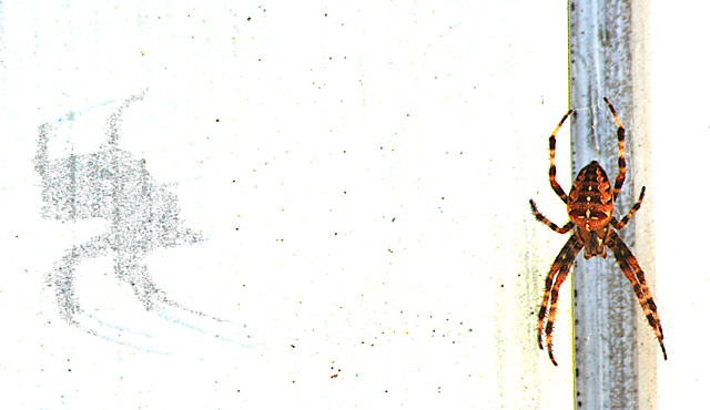
I think this was one of the cooler shots in the challenge (and it met the challenge topic well IMHO).
Composition:
Good. Nice offset balance of the spider and shadow. The specks are a little distracting, but I think add to the roughness and contrast of the shot.
Lighting:
A tad bright, but not blown out. Very contrasty. As I said earlier, I would like to have seen a little more darkness to the shadow.
Focus:
While good, it's not tack sharp and I think that if it had been, the score would have been higher.
Color:
Like the rich colors of the spider. A little more color in other areas of the shot might have helped a tad, but I like the starkness too.
Overall:
I think a very strong entry. Very cool capture. Thanks for sharing how you did it too! :-) |
|
Comments Made During the Challenge  |
|
|
09/11/2005 06:44:26 PM |
| Good contrast areas, perhaps a bit too much bright white for me though. |
|
|
|
09/11/2005 02:52:24 AM |
| Cool shot, like the spider would have been more... maybe, dramtic, if there was more detail on the spider. Always like bug macro shots! |
|
|
|
09/09/2005 11:53:41 PM |
| i really like this. pushes way over the border of digital art, but that works for me. the balance is great and the shadow not being symmetrical really keeps the shot interesting. and the speckles in the center really help hold everything together. |
|
 Photographer found comment helpful. Photographer found comment helpful. |
|
|
09/06/2005 10:14:31 PM |
| To much blown out ... high contrast but to much ... my 1 cent |
|
| Photographer found comment helpful. |
|
|
09/05/2005 09:36:32 PM |
| Nice image...feels a bit too PS'd..but I'm also a perpetraitor of that crime at times... nice work! :-D |
|
| Photographer found comment helpful. |
|
|
09/05/2005 07:43:23 PM |
| All right - now this is pretty wicked! VERY cool. Interested to read how you accomplished this. Personally, I think I would have preferred more darkness to the shadows, but still a very cool shot. |
|
| Photographer found comment helpful. |
|
|
09/05/2005 10:03:41 AM |
| I really like the washed out effect of the background and how you captured the spider's shadow. Awesome! |
|
| Photographer found comment helpful. |
|
|
09/05/2005 09:25:36 AM |
| too much white, not modifying your subject to me |
|
| Photographer found comment helpful. |
|
|
09/05/2005 12:20:05 AM |
| Great concept...it had such potential! 6 |
|
| Photographer found comment helpful. |
Home -
Challenges -
Community -
League -
Photos -
Cameras -
Lenses -
Learn -
Help -
Terms of Use -
Privacy -
Top ^
DPChallenge, and website content and design, Copyright © 2001-2025 Challenging Technologies, LLC.
All digital photo copyrights belong to the photographers and may not be used without permission.
Current Server Time: 04/01/2025 11:29:30 PM EDT.