| Author | Thread |
Comments Made During the Challenge  |
|
|
09/11/2005 09:52:10 PM |
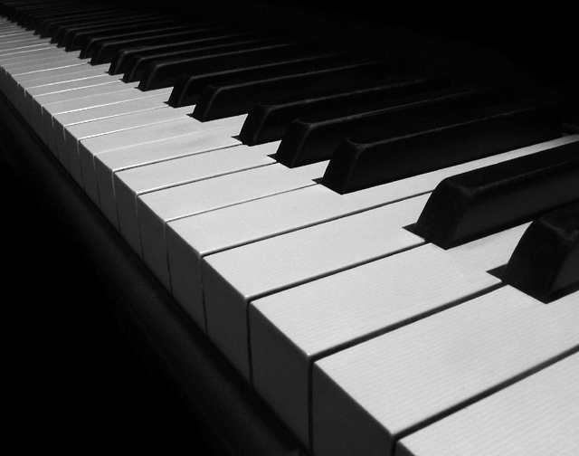
| nice placement and angle. I think the keys could be a little whiter, but all in all, a good photo. |
|
 Photographer found comment helpful. Photographer found comment helpful. |
|
|
09/11/2005 09:49:09 PM |
| I like the concept, but for me, I wish there was even greater whites on the keys themselves. |
|
| Photographer found comment helpful. |
|
|
09/11/2005 05:45:45 PM |
|
| Photographer found comment helpful. |
|
|
09/11/2005 07:24:09 AM |
| I was going to say "obvious", but nobody else thought of it (including me). And I'm pleased about that because you have composed and executed the photograph superbly, and I'd have probably made a hash of it! Bravo! 8 |
|
| Photographer found comment helpful. |
|
|
09/10/2005 07:47:02 AM |
| Nice lines in the composition, strong subject. I particularly like the detail in the ebony keys. Would like to see a little more highlight. 10. |
|
| Photographer found comment helpful. |
|
|
09/10/2005 03:16:10 AM |
Damn. Why didn't I think of doing something like this??? So simple but perfect for this challenge. Come to think of it, perfect for the Perspective challenge too!
Good work: 8 |
|
| Photographer found comment helpful. |
|
|
09/10/2005 01:08:31 AM |
| Good idea, I love how you can even see the lines on the keys. |
|
| Photographer found comment helpful. |
|
|
09/08/2005 07:36:46 PM |
Nice idea... whites aren't quite white enough for me however... :)
|
|
| Photographer found comment helpful. |
|
|
09/06/2005 10:44:42 PM |
| I think the "white" is actually quite neutral. A good idea and composition though. 7 |
|
| Photographer found comment helpful. |
|
|
09/06/2005 09:53:29 PM |
| Excelent choice and perspective |
|
| Photographer found comment helpful. |
|
|
09/06/2005 07:57:54 PM |
| this is awesome!! i adore this photo:) |
|
| Photographer found comment helpful. |
|
|
09/06/2005 12:50:04 PM |
|
| Photographer found comment helpful. |
|
|
09/06/2005 10:40:25 AM |
| very nice image. good luck! |
|
| Photographer found comment helpful. |
|
|
09/06/2005 04:50:36 AM |
| I think the idea is good, the perspective on this is great, but it actually suffers from a lack of contrast...too much grey where they could be white. Advanced editing was allowed, so I think you could've played with the results a little. :) |
|
| Photographer found comment helpful. |
|
|
09/05/2005 08:09:49 PM |
| Beautiful presentation and meets the challenge well. There seems to be something missing to make the image really pop, but it's tough to find much wrong with it. Great job. |
|
| Photographer found comment helpful. |
|
|
09/05/2005 05:06:20 PM |
| Very very nice image. Beautiful contrast and composition. |
|
| Photographer found comment helpful. |
|
|
09/05/2005 02:02:30 PM |
| the perfect example of high contrast 9 (would have cropped a teeny bit off the top) |
|
| Photographer found comment helpful. |
Home -
Challenges -
Community -
League -
Photos -
Cameras -
Lenses -
Learn -
Help -
Terms of Use -
Privacy -
Top ^
DPChallenge, and website content and design, Copyright © 2001-2025 Challenging Technologies, LLC.
All digital photo copyrights belong to the photographers and may not be used without permission.
Current Server Time: 04/02/2025 05:35:48 AM EDT.