| Author | Thread |
|
|
09/15/2005 04:14:13 PM |
Hello, and greetings from the Critique Club. I am your critiquer, Artyste, and for the next little while, I shall proceed with telling you everything you really don't want to hear :)
Initial Thoughts
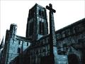
Pretty nice fog and landscape of a skyline, love the tones, might be in the wrong challenge.
Composition / Content
Everything is really good about this composition except one thing. In a photo like this, where you have areas above and below your subject with equal lack of interest (sky and ground in this case), it is usually better to drop your area of interest (the skyline and treeline here), closer to the bottom of the photo. I realize that you were trying to get a darker area to compete with your light area for the "high contrast", but it ultimately fails, and I'll tell you why in a little bit. Having your focal interest lower provides a better anchor for the photo, and eliminates space that distract. In this instance, a more "panoramic" view would have helped the photo itself. (You don't have to add more sky, necessarily, just cropped out about an inch of ground.)
Of course, that's just a suggestion from a bit of reading I've been doing, and personal experience.
Background
A nice fade out into your sky, which is clean and not overly bright.
Camera Work / Technical
You seem to have metered nicely and gotten a good exposure, focus is good as well. Without processing steps, however, I'm not sure if you achieved this in camera or not. Hard to comment. One of the things I can tell you, on the technical side, is this: This photo isn't exactly a great example of a *high* contrast situation. With high contrast, what you are looking for is a stark change from low light values to bright light values in an image. Here, you have a wonderful foggy fade from dark to light. Lots and lots of midtones between the two. This isn't high contrast as I see it. Sure, you have areas of light and dark, but they don't make the change into each other with sharply. Too many mid-values between. This probably cost you a lot of votes.
Digital Processing
I cannot comment on this area, as you haven't mentioned what you did.
Fits the Challenge
As I mentioned above, I feel that you didn't fully meet the challenge because of the fact that there are too many mid-tone values in this image, especially between your darkest and lightest values.
My Opinion of the Photo
Very well taken. With some minor tweaks, and a more "panoramic" feel, this would look good in a large print hanging from any wall. I just feel that it was too loose with the challenge connection (and possibly just too grey and moody), to get you the higher DPC scores that it could probably get in some other challenges. A great attempt. Good luck in future challenges. |
|
 Photographer found comment helpful. Photographer found comment helpful. |
Comments Made During the Challenge  |
|
|
09/11/2005 08:10:56 AM |
| Quite a bleak feeling show. Not enough real blacks for my liking. 8. |
|
| Photographer found comment helpful. |
|
|
09/11/2005 12:37:03 AM |
| There is contrast at the top and at the bottom. Unfortunately the middle is mostly the same grayscale. Also, perhaps cropping out either more of the sky or more of the foreground (so everything wasn't so even/centered), the photo would have more interest. |
|
| Photographer found comment helpful. |
|
|
09/10/2005 01:28:30 AM |
| Nice shot, the fog is great. |
|
| Photographer found comment helpful. |
|
|
09/09/2005 04:08:36 PM |
| Interesting mood. I think the blown out sky takes away--perhaps if you'd reduced the amount of spce it takes up in your image... |
|
| Photographer found comment helpful. |
|
|
09/08/2005 11:55:36 PM |
What an amazing photo. I love the gradual misty feel to it... and the contrast is indeed really high contrast!
I do wonder though if a tighter crop might have made it even better, at least IMHO. It seems that there is a lot of sky AND a lot of grassy foreground... maybe choosing one or the other? But in any case, well done! a 10 |
|
| Photographer found comment helpful. |
|
|
09/08/2005 01:15:28 PM |
| I would like to see the color version of this, although the black and white is good and probabpy has more impact for this challenge. Nice work. |
|
| Photographer found comment helpful. |
|
|
09/06/2005 11:13:58 PM |
| Ohhh...neat! Love the mist inbetween, the clear seperation of city and country. Very nice. |
|
| Photographer found comment helpful. |
|
|
09/05/2005 05:09:52 PM |
| This is beautiful. I love the almost steamy look in the trees, |
|
| Photographer found comment helpful. |
|
|
09/05/2005 02:25:16 PM |
| Nice - the foreground representing nature is well contrasted with the skyline and haze in the upper half of the shot. |
|
| Photographer found comment helpful. |
|
|
09/05/2005 09:35:29 AM |
| I like this one. I like how the buildings get lighter in tone as they recede into the distance. |
|
| Photographer found comment helpful. |
|
|
09/05/2005 12:47:17 AM |
|
| Photographer found comment helpful. |
Home -
Challenges -
Community -
League -
Photos -
Cameras -
Lenses -
Learn -
Help -
Terms of Use -
Privacy -
Top ^
DPChallenge, and website content and design, Copyright © 2001-2025 Challenging Technologies, LLC.
All digital photo copyrights belong to the photographers and may not be used without permission.
Current Server Time: 03/16/2025 07:37:37 PM EDT.