| Author | Thread |
|
|
09/18/2005 12:14:38 PM |
Salut from the Critique Club!
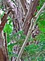
With your title, you've capture that autumn feel with the red of the needles from the tree, and met the challenge theme quite nicely. There are a few things that I think will help.
Size: Check out the tutorial on sizing images for DPC. DPC'ers not only don't like small pictures in challenges (many will vote it down!), but you lose detail when looking at a picture that is smaller than it could be.
Composition: Having the red needles follow the rule of thirds make this picture interesting and nice to look at. The only distracting thing is the thick trunk of a tree on the left. I feel it uneccessarily detracts from the focus of the picture, which is the red of the needles.
Focus: The small size of the photo makes it difficult to tell if how in focus the picture is. It seems as though the picture is not quite as sharp as it could be, but as I said, it's difficult to tell.
Color/Lighting: The light on the red needles is excellent. It makes the red really stand out. However, I think a little tweaking of color in post processing will not only bring out the red more, but improve the background colours so it stands out more. Red is a vibrant colour that your eye goes to, so adjusting the color can make it really POP against the background.
Depth of Focus: One way photographers make things stand out is by blurring the background of your photo. Check out this tutorial on depth of focus.
I see you've only entered two challenges so far. I hope to see you shooting more!
Hope this helps, and if you have any questions, feel free to ask!
Cheers
pidge |
|
 Photographer found comment helpful. Photographer found comment helpful. |
Comments Made During the Challenge  |
|
|
09/13/2005 12:13:37 PM |
|
| Photographer found comment helpful. |
|
|
09/13/2005 10:43:18 AM |
| too small. I'm sure you have already heard this. |
|
| Photographer found comment helpful. |
|
|
09/12/2005 09:21:20 PM |
| Vulnerable, delicate, barely hanging on.... a statement shot. I like it. 7 |
|
| Photographer found comment helpful. |
|
|
09/12/2005 04:28:10 PM |
| Interesting, but not a good photo. Take at a higher reoslution. |
|
| Photographer found comment helpful. |
|
|
09/10/2005 10:51:54 PM |
| The maximum size for any side of your photo is 640px... this is 350px on the long side - just over 1/2 the maximum. Submiting a small shot makes it hard to see and tough to judge... content and colorwise it's good. that size thing hurts a lot here. |
|
| Photographer found comment helpful. |
|
|
09/10/2005 12:24:29 PM |
IMO the background is just too busy and distracting to get the viewer to focus in on the red. Also -- a larger pic works better for the viewer to be able to see the content of the photo
|
|
| Photographer found comment helpful. |
|
|
09/10/2005 11:25:48 AM |
| Hard to judge this shot properly since the image is so small. From what I can make out I like the strong use of line, and the splash of colour in the red leaves. Nice composition. |
|
| Photographer found comment helpful. |
|
|
09/09/2005 08:47:46 AM |
| A little small. You can use up to 640 pixels for your shots. Next time use that much and I'm sure your scores will grow with your picture size. :) |
|
| Photographer found comment helpful. |
|
|
09/08/2005 08:54:45 PM |
|
| Photographer found comment helpful. |
|
|
09/07/2005 07:46:57 PM |
| I would have liked it if you had more focus on the branch because I get kind of lost and uninterested the way it is now. |
|
| Photographer found comment helpful. |
|
|
09/07/2005 06:56:54 PM |
| The photo here is smaller than all the others, but not to the extreme of getting a low score. The low score comes with the lack of interesting subject matter. It may of been very pretty in person, but for me it just didn't transfer well to a photo. |
|
| Photographer found comment helpful. |
|
|
09/07/2005 02:12:12 PM |
| looks more like death than autumn |
|
| Photographer found comment helpful. |
|
|
09/07/2005 09:40:40 AM |
| I'd love this if it were larger. The single red amidst the green and gray is a nice contrast, but being so small, it doesn't have the impact I think you were going for. |
|
| Photographer found comment helpful. |
|
|
09/07/2005 12:23:44 AM |
| The picture should be larger. It's hard to tell what's there. |
|
| Photographer found comment helpful. |
Home -
Challenges -
Community -
League -
Photos -
Cameras -
Lenses -
Learn -
Help -
Terms of Use -
Privacy -
Top ^
DPChallenge, and website content and design, Copyright © 2001-2025 Challenging Technologies, LLC.
All digital photo copyrights belong to the photographers and may not be used without permission.
Current Server Time: 03/14/2025 06:10:14 AM EDT.