| Author | Thread |
Comments Made During the Challenge  |
|
|
09/11/2005 09:31:15 PM |
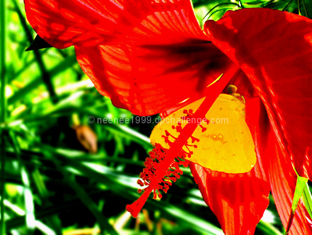
| With the red and green you definitely have some contrast. For my untrained eye though, the red almost seems...too fake or overly done in a photo editing program. |
|
 Photographer found comment helpful. Photographer found comment helpful. |
|
|
09/10/2005 10:37:12 PM |
Yes, I see you!
I think you worked too hard to get the contrast. |
|
| Photographer found comment helpful. |
|
|
09/08/2005 11:09:05 PM |
| Love the colros, not sure if the hot spots on the hibiscus are from the level adjustments, but is a bit distracting. Still a wonderful shot EDIT-- Bumped to a 7 |
|
| Photographer found comment helpful. |
|
|
09/07/2005 10:02:43 PM |
| Great shot, the red on yellow and greed is fantastic! |
|
| Photographer found comment helpful. |
|
|
09/07/2005 04:35:46 PM |
Fit Challenge Criteria: 2/2
Color/Contrast: 0/2
Composition: 1/2
Photo Quality: 0/2
My Subjective Affinty: 0/2
These colors are way over saturated so almost all detail is lost. I'm looking at a red silhouette. It's kind of weird. I can't see a whold lot of focus anywhere in the photo. |
|
| Photographer found comment helpful. |
|
|
09/05/2005 07:18:55 PM |
| Wow - now that's vivid! :-) I really like the composition here and I think the complimentary colors contrast nicely. |
|
| Photographer found comment helpful. |
|
|
09/05/2005 12:29:41 PM |
| woah, way over saturated and it makes the whole shot to hard to look at. |
|
| Photographer found comment helpful. |
Home -
Challenges -
Community -
League -
Photos -
Cameras -
Lenses -
Learn -
Help -
Terms of Use -
Privacy -
Top ^
DPChallenge, and website content and design, Copyright © 2001-2025 Challenging Technologies, LLC.
All digital photo copyrights belong to the photographers and may not be used without permission.
Current Server Time: 03/12/2025 09:01:01 PM EDT.