| Author | Thread |
Comments Made During the Challenge  |
|
|
09/13/2005 11:27:18 PM |
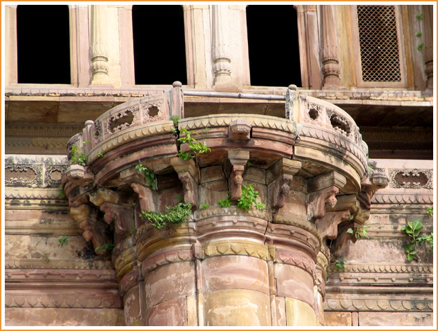
| Seems to be tilted back, but I think it adds interest to it. Nice textures. |
|
 Photographer found comment helpful. Photographer found comment helpful. |
|
|
09/12/2005 08:30:51 PM |
| I love it! The plants are a really nice artistic touch. Good composition. it's just a great job. |
|
| Photographer found comment helpful. |
|
|
09/11/2005 01:23:42 AM |
| I think this would have benefitted from more tightly croping the top of the collumn |
|
| Photographer found comment helpful. |
|
|
09/10/2005 10:20:56 AM |
| love the colors, this is very nice |
|
| Photographer found comment helpful. |
|
|
09/09/2005 08:25:07 PM |
| I like the border...but the image is boring. It's a cool building, but the it's uniteresting becacuse there is no angle or different perspective. |
|
| Photographer found comment helpful. |
|
|
09/09/2005 10:56:25 AM |
| lots of character here! I think an even tighter crop of capital would showcase the green vines even better IMHO. |
|
| Photographer found comment helpful. |
|
|
09/07/2005 11:04:26 PM |
| Life really does go on doesnt it? Love it |
|
| Photographer found comment helpful. |
|
|
09/07/2005 10:58:17 PM |
wow, what a beautiful place.
I think this photo would be more effective if it were cropped to leave out the black windows and show the column/branches more clearly. In any case it's a very nice picture, and a good exposure, with good highlights and rich shadows. |
|
| Photographer found comment helpful. |
|
|
09/07/2005 08:36:59 PM |
| For this photo I foccus more of the architecture instead of the branches. But I still like it. |
|
| Photographer found comment helpful. |
|
|
09/07/2005 07:47:54 PM |
| I would like to see more branch and less architecture. But it is a nice photo. |
|
| Photographer found comment helpful. |
|
|
09/07/2005 06:07:35 PM |
| very pretty! love the colors! |
|
| Photographer found comment helpful. |
|
|
09/07/2005 10:45:07 AM |
| This would be a great study in black and white with high contrast. I'd crop to the right or left side so that the column isn't dead centered. |
|
| Photographer found comment helpful. |
|
|
09/07/2005 08:08:53 AM |
| Seems poorly composed with the subject too central in the frame, even though the shot is taken off to the side a bit. |
|
| Photographer found comment helpful. |
Home -
Challenges -
Community -
League -
Photos -
Cameras -
Lenses -
Learn -
Help -
Terms of Use -
Privacy -
Top ^
DPChallenge, and website content and design, Copyright © 2001-2025 Challenging Technologies, LLC.
All digital photo copyrights belong to the photographers and may not be used without permission.
Current Server Time: 03/11/2025 12:40:42 PM EDT.