| Author | Thread |
|
|
06/06/2003 11:34:38 AM |
| What did I mis?? I thought this was a winner. I wish I had given it a 10 instead of a nine, |
|
Comments Made During the Challenge  |
|
|
06/03/2003 09:33:45 PM |
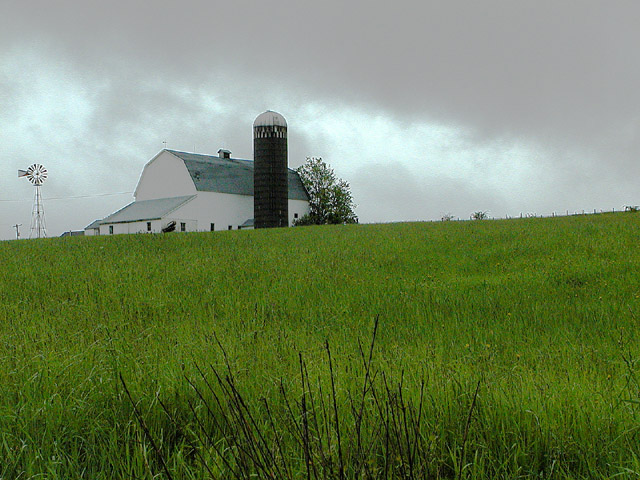
I like the green grass with the gray clouds, moody picture...
nice capture... |
|
|
|
06/03/2003 08:40:30 PM |
| Exposure seems good and composition on the most part is ok. One thing I might have done would be to take a lower vantage point to fill the frame with more grass and less sky. An alternative would be to have more sky and less grass but I don't think that would have as much impact since the green is so vivd. |
|
|
|
06/03/2003 03:44:07 PM |
| interesting perspective..... |
|
|
|
06/03/2003 02:47:16 PM |
| Not seeing the bottom of the barn, gives it a cut and paste look, the line over the hill is too strong. |
|
|
|
06/03/2003 01:39:01 PM |
| The texture of the clouds inhances the quality of the photo. |
|
|
|
06/03/2003 04:56:36 AM |
|
|
|
06/03/2003 01:53:36 AM |
| Beautiful I wish it were my home. Very nice! |
|
|
|
06/01/2003 03:13:05 PM |
| beautiful contrast with the bright grass versus the dull sky |
|
|
|
05/31/2003 11:33:41 AM |
| Horizon isn't level - I'm sure you'll be scored down by a lot of people for it. Sucks to be them. The viewpoint seems to be looking up a hill, I LIKE that it looks like it's on a hill. 8 |
|
|
|
05/31/2003 09:59:20 AM |
| One of my favourites this week. Good composition and the colors are perfect. So is focus and cropping. Meets the challenge very well. Well done and good luck! |
|
|
|
05/29/2003 10:38:18 PM |
| You should have tried to show a little more of the farm on this picture. |
|
|
|
05/29/2003 03:56:39 PM |
5. Fits the theme well enough, and there are no blatant 'you suck!' flaws to it, but neither does it really grab me for any reason at all. For reasons of composition, cropping, or subject choice, it's just a photo, and doesn't do especially much for me, aesthetically.
The crop and focus almost makes the shot about the grass in the foreground, which is an odd choice. If the grass were more blurred and the building in better focus, that might make the building central. If the shot were aimed slightly more left (building at left edge, windmill near center and focussed sharp), likewise. Also, the overprocessed odd color of the sky's kind of distracting. |
|
|
|
05/28/2003 09:13:17 PM |
| Good picture. I think it would be really a lovely picture taken with a little sunshine. |
|
|
|
05/28/2003 02:15:48 PM |
|
 Photographer found comment helpful. Photographer found comment helpful. |
|
|
05/28/2003 04:52:01 AM |
| the few strands of ....?..... at the bottom are distracting. you should have left them out from the photo. |
|
| Photographer found comment helpful. |
|
|
05/28/2003 01:44:39 AM |
|
| Photographer found comment helpful. |
Home -
Challenges -
Community -
League -
Photos -
Cameras -
Lenses -
Learn -
Help -
Terms of Use -
Privacy -
Top ^
DPChallenge, and website content and design, Copyright © 2001-2025 Challenging Technologies, LLC.
All digital photo copyrights belong to the photographers and may not be used without permission.
Current Server Time: 03/12/2025 08:08:14 PM EDT.