| Author | Thread |
|
|
06/10/2003 09:26:57 AM |
Greetings from the Critique Club!
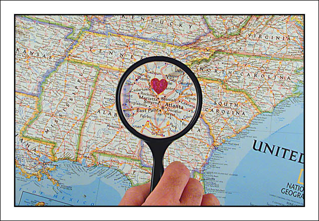
This is a really good idea to use the map and the heart. The magnifier is the cherry on top. Creative idea and well executed. The hand adds a personal touch too.
Your lighting is nice and even, with no harsh shadows or blown out spots.
There are no jaggies, artifacts, pixelation, etc, so your processing is good too.
There is nothing I'd change about this. You did a wonderful job.
Keep shooting. I look forward to more of your work.
Regards,
Grayce |
|
Comments Made During the Challenge  |
|
|
06/03/2003 09:59:48 PM |
|
|
|
06/03/2003 05:56:37 PM |
| Great interpretation! There were so many pictures with that title but this is a nice twist on the subject. The magnifying glass is perfect. |
|
|
|
06/03/2003 12:19:52 PM |
| Make the heart more solid red coloring, but good idea |
|
|
|
06/02/2003 09:10:13 PM |
|
|
|
06/02/2003 06:06:57 PM |
| very cute idea. :) I like the inclusion of the hand and the magnifying glass. :) |
|
|
|
06/02/2003 05:21:39 PM |
| The centered magnifying glass with the vertical being juuuuuust off-perpendicular is a little distracting, would have preferred more of an angle on the glass' handle. I like the very literal interpretation, complete with "heart" drawn on. Very cute. It conveys the information you want to convey, just would have preferred a slightly less formal composition. |
|
|
|
06/02/2003 05:16:27 PM |
|
|
|
06/02/2003 04:25:13 PM |
| This is interesting, I like it. |
|
|
|
06/02/2003 09:33:07 AM |
| Clever idea. Cute take on the challenge, as well as well done. 8 |
|
|
|
06/01/2003 09:49:33 PM |
| choice idea...really clever! |
|
|
|
05/29/2003 03:38:46 PM |
| good original perception of challenge. 8 |
|
|
|
05/29/2003 03:00:16 PM |
| Clever. A reverse of what a lot of people have done, which is change the line to fit their home - you changed the map! :) Like it. |
|
|
|
05/29/2003 09:55:02 AM |
| good approach to the challenge |
|
|
|
05/28/2003 02:34:31 PM |
| This is cute. Pretty clean execution. 8 |
|
|
|
05/28/2003 01:34:13 PM |
|
|
|
05/28/2003 11:37:36 AM |
| Like the idea, nicely executed. |
|
 Photographer found comment helpful. Photographer found comment helpful. |
|
|
05/28/2003 11:17:02 AM |
| I love this photo... very sharp, nice idea. Effective border. 8 |
|
| Photographer found comment helpful. |
|
|
05/28/2003 09:50:02 AM |
|
| Photographer found comment helpful. |
|
|
05/28/2003 02:39:38 AM |
| straight the the heart! interesting idea! |
|
| Photographer found comment helpful. |
|
|
05/28/2003 01:50:47 AM |
|
| Photographer found comment helpful. |
|
|
05/28/2003 01:05:29 AM |
| Interesting spin on the challenge. Definitely original. I do think your border is unnecessary and I would have left the hand out of the pic. Maybe you could have made your subject off center to draw our eyes to one side of the photograph. Nice clarity in photo. |
|
| Photographer found comment helpful. |
|
|
05/28/2003 12:28:06 AM |
| Best picture I've seen in the challenge so far. Nice job. |
|
| Photographer found comment helpful. |
Home -
Challenges -
Community -
League -
Photos -
Cameras -
Lenses -
Learn -
Help -
Terms of Use -
Privacy -
Top ^
DPChallenge, and website content and design, Copyright © 2001-2025 Challenging Technologies, LLC.
All digital photo copyrights belong to the photographers and may not be used without permission.
Current Server Time: 03/12/2025 06:02:30 PM EDT.