| Author | Thread |
|
|
06/05/2003 04:43:34 PM |
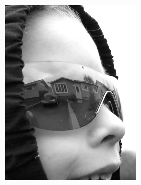
Hi, sorry I didn't get around to commenting this during the challenge. I gave this an 8. The photo is well taken. The black and white contrast levels seem to work very well. It is sharp, very sharp. The composition - good, but not quite GREAT. The use of the sunglasses/mirror works well, but could have been centered in one lens a bit better (it's a nit, but after all, I didn't mark this down that much). The hood is good, but the crop of part of the mouth just bugs me a bit (all or nothing, that's what I say!). I would have liked more mouth, it appears to be smiling and would further the idea of HSH. I know you can't control the weather, but the dark skies...eh, I wouldn't have marked it down for that, but others might.
Finally, the hook - although obviously special to you, I don't see any WOW or other interest(re:hook) item to pull my (non-biased) interest into this photo. I always ask - Would I hang this on my wall? I think you would answer YES! Me, probably not, but honestly it's nothing personal, just didn't "grab" me. I hope this helps. Rob the Swash |
|
 Photographer found comment helpful. Photographer found comment helpful. |
|
|
06/05/2003 11:51:40 AM |
Hello there! Since in the "comments" thread you mentioned that you wished you'd had more constructive comments, I'll leave one of my trademark super-wordy "this is good but that could be better" comments for you. :)
What I liked a lot: the expression on the kid's face, the joy that comes across, made it feel like home SWEET home. The reflection is really clean. It definitely meets the topic. Oh, and the use of the hood was good for framing the image and directing the eye inward.
What I liked less: the upper right is SO white it feels harsh, and because it blends into the border there's no contrast up there. The sunglasses, while I understand the necessity for using them to capture a large enough reflection, are too big for his face and that distracted me for a second. The cropping would have been improved, I think, by going a BIT lower so it didn't look like he was biting the bottom edge of the photo. :) And I might have brought the right edge in a little to minimize the stark white. Finally, I'm personally not fond of portraits of people I don't know, but that's my own prejudice and has nothing whatsoever to do with the quality of your photo.
So there you have it. :) I gave this photo a 6, which is my "meets the challenge and has nothing particularly negative about it but doesn't leap ahead of the pack for me either" score. Hope that helps! |
|
| Photographer found comment helpful. |
Comments Made During the Challenge  |
|
|
06/03/2003 11:42:40 PM |
| Good stuff. I especially like you chose to include a hint of the expression in the mouth. The hood was a good choice as well. |
|
| Photographer found comment helpful. |
|
|
06/03/2003 01:50:52 PM |
| The hat adds nice texture to the photo. |
|
| Photographer found comment helpful. |
|
|
06/03/2003 01:06:06 PM |
|
| Photographer found comment helpful. |
|
|
06/03/2003 06:48:21 AM |
| Very nice tones, though I think cropping could have been improved to get in tighter (through middle of nose) to enhance the abstract nature of the shot. |
|
| Photographer found comment helpful. |
|
|
06/03/2003 04:44:15 AM |
| Great idea! I really like this. 10 |
|
| Photographer found comment helpful. |
|
|
06/02/2003 08:17:25 PM |
| hey. i already saw this somewhere. its a really good shot and will do very well. |
|
| Photographer found comment helpful. |
|
|
06/02/2003 01:10:26 AM |
| very nice..thanks for sharing |
|
| Photographer found comment helpful. |
|
|
06/01/2003 01:02:42 AM |
| Certainly got the \"be creative\" part. Good job. I like the use of black andwhite and the tonal range. |
|
| Photographer found comment helpful. |
|
|
05/30/2003 05:08:19 PM |
|
| Photographer found comment helpful. |
|
|
05/29/2003 04:57:20 PM |
| Of the two (or was it more?) like this, I liked this one more (most?). Probably because of the angle and the fact that it's black and white. Cool stuff. |
|
| Photographer found comment helpful. |
|
|
05/28/2003 01:10:17 PM |
| This is just so good! fantastic in fact - 10. |
|
| Photographer found comment helpful. |
|
|
05/28/2003 11:54:12 AM |
| The same idea as mine - nicely done! |
|
| Photographer found comment helpful. |
|
|
05/28/2003 08:18:59 AM |
| Imaginatively done. Well executed. I like the way it's been cropped. 9 |
|
| Photographer found comment helpful. |
|
|
05/28/2003 08:03:36 AM |
| Very nice idea and it turned outwell. |
|
| Photographer found comment helpful. |
|
|
05/28/2003 02:30:35 AM |
|
| Photographer found comment helpful. |
|
|
05/28/2003 01:36:23 AM |
Yahess ! Someone took note of the "be creative" part of the challenge !
What excellent focus. |
|
| Photographer found comment helpful. |
|
|
05/28/2003 12:49:09 AM |
| Good photo...I like that's it's not a boring straight on shot of the house. |
|
| Photographer found comment helpful. |
Home -
Challenges -
Community -
League -
Photos -
Cameras -
Lenses -
Learn -
Help -
Terms of Use -
Privacy -
Top ^
DPChallenge, and website content and design, Copyright © 2001-2025 Challenging Technologies, LLC.
All digital photo copyrights belong to the photographers and may not be used without permission.
Current Server Time: 03/12/2025 09:46:35 PM EDT.