| Author | Thread |
|
|
09/28/2005 06:33:22 AM |
Thank you very much for this critique, I found it very useful.
I think you are right in your comments, next time I will try to do it a little bit better. :) |
|
|
|
09/27/2005 04:02:27 PM |
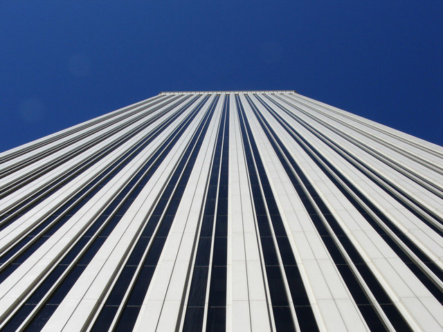
From the Critique Club
Nice perspective of a tall building but find the focus to be a bit soft especially on the right side. You had a few distractions (lens dust) that were visible in the blue sky, which was a distraction. Your exposure, lighting and color are good and works well within your photograph.
The balance of your photograph is slightly off in my opinion. The top of the building is tilted to the left. And by the building being off to the side a little affects the balance. Your subject is interesting especially the line to the left; the lighting seems to bring them out more that on the right. I like the simplicity of the shot and think it worked well other than the minor distractions.
Your subject is not very strong lacking the wow factor to me but it is an eye-appealing photograph. I like the leading lines. This type of photograph is very common and demands an unusual effect to make it effective. With your photograph scoring right on the average score shows that fact.
You have a good shot and with a little tweaking it could have been even better. I see this is your first challenge entered (good score for first challenge). Keep up the good work and I hope you find this critique helpful.
|
|
 Photographer found comment helpful. Photographer found comment helpful. |
Comments Made During the Challenge  |
|
|
09/20/2005 09:53:22 PM |
| Neat shot- nice use of line. |
|
| Photographer found comment helpful. |
|
|
09/19/2005 08:03:13 PM |
| It has perspective, but it's not very interesting to me. |
|
| Photographer found comment helpful. |
|
|
09/18/2005 03:42:53 PM |
|
| Photographer found comment helpful. |
|
|
09/16/2005 07:10:28 PM |
| Nice clean image with lots of good perspective. Good Job! |
|
| Photographer found comment helpful. |
|
|
09/15/2005 07:34:00 PM |
| I like the lines and wish the sky weren't so dark blue. However, the lines are not entirely going to the middle, and I feel that I see more of one side of the facade than the other, which bothers me, because it's so close to being centered, but not quite. |
|
| Photographer found comment helpful. |
|
|
09/14/2005 08:32:17 PM |
|
| Photographer found comment helpful. |
|
|
09/14/2005 07:05:42 PM |
| great perspective - i get dizzy if i look any longer.... |
|
| Photographer found comment helpful. |
|
|
09/14/2005 01:08:03 AM |
| Nice view of Torre Picasso. My office used to be on the 24th floor. |
|
| Photographer found comment helpful. |
|
|
09/14/2005 01:00:12 AM |
| Beautiful, beautiful! Excellent use of leading lines and great composition...I love it! |
|
| Photographer found comment helpful. |
Home -
Challenges -
Community -
League -
Photos -
Cameras -
Lenses -
Learn -
Help -
Terms of Use -
Privacy -
Top ^
DPChallenge, and website content and design, Copyright © 2001-2025 Challenging Technologies, LLC.
All digital photo copyrights belong to the photographers and may not be used without permission.
Current Server Time: 03/12/2025 08:08:34 AM EDT.