| Author | Thread |
|
|
06/06/2003 01:56:13 AM |
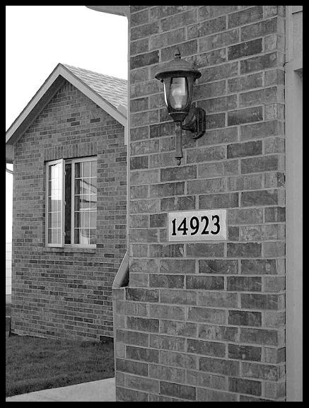
Good work. I was just looking at your photo and I agree with shadow... The black and white image is very good but probably doesn't echo the "home sweet home" theme. It looks a little bit cold. I would try to recolour the photo to a sepia (brown / orange) type of colour.
Besides that the image is very good - lovely detail, lovely exposure and lighting. There is some parallax (ie: top of buildings narrower than bottom) but it's not major. The border is ok - almost too large but just ok in my opinion. |
|
 Photographer found comment helpful. Photographer found comment helpful. |
Comments Made During the Challenge  |
|
|
06/03/2003 01:14:14 PM |
|
| Photographer found comment helpful. |
|
|
06/02/2003 10:07:08 PM |
| Nice focus and good exposure and I like the different shapes, but I think you the border is inappropriate here. |
|
| Photographer found comment helpful. |
|
|
06/02/2003 05:06:28 PM |
| There's something about this image that works somehow, even though the subject itself is not particularly exciting. The contrast could be cranked up a little bit more, but in general I don't know why I like it, but I do. :) |
|
| Photographer found comment helpful. |
|
|
06/02/2003 01:39:35 PM |
| i like the black and white look to the picture it brings alot of intrest to it nice job |
|
| Photographer found comment helpful. |
|
|
05/28/2003 02:07:45 AM |
| somehow I'd prefer to see this photo in sepia or maybe soft colour tones. the brick walls should be able to give off a warm glow of orange. |
|
| Photographer found comment helpful. |
Home -
Challenges -
Community -
League -
Photos -
Cameras -
Lenses -
Learn -
Help -
Terms of Use -
Privacy -
Top ^
DPChallenge, and website content and design, Copyright © 2001-2025 Challenging Technologies, LLC.
All digital photo copyrights belong to the photographers and may not be used without permission.
Current Server Time: 12/14/2025 07:20:56 PM EST.