| Author | Thread |
|
|
09/21/2005 02:07:31 PM |
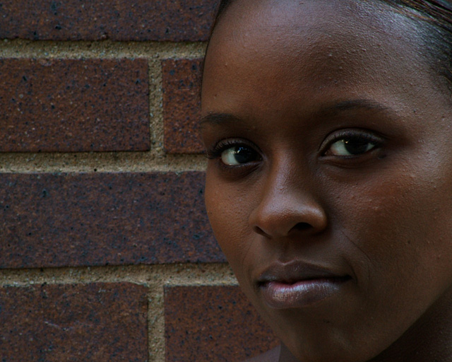
Greetings from the Critique Club!
Thank you so much for detailed information on your image. It helps greatly!
You got many comments on this image during the challenge and they all have different ideas for what they would like in the image. All are as valid as any I can give.
Reading through your comments, I note that you state you don't have much experience in portrait processing. Believe it or not I think you have the hardest part down - taking a great image. There are many ways to process a portrait and none of them are right or wrong - it all just depends on your taste. I prefer the look you used - the natural approach.
Two things to maybe work on with a close portrait like this where the background is irrelevent: the eyes and the background. With the eyes, typically you want them to be sharp - not overly so they look out of place, but just so viewer's eyes are drawn to them. Another thing to check with the eyes is the whites. People prefer them white. This also makes them stand out.
The background in this particular image works for me. However, it does distract from the face a little, so you may want to lighten, darken, blur or anything really. This again would put more emphasis on the face.
Honestly, you started with a great image. Technically well done. I did a quick edit to show what might result from some of the suggestions I and other commenters made but really, its all a matter of taste.
 |
|
Comments Made During the Challenge  |
|
|
09/18/2005 11:41:25 PM |
| Great comp and colors.One of my favorites in this comp. |
|
 Photographer found comment helpful. Photographer found comment helpful. |
|
|
09/17/2005 10:16:58 AM |
| She is lovely and the lighting is nicely done. I think I might have used a little post editing to soften some of the imperfections in her skin and still left it with a natural feel. The bricks create a monochromatic theme with her dark skin tones, but I'm thinking either a black solid background or possibly a white one would really give this some more punch since the pattern is a bit distracting from her face. |
|
| Photographer found comment helpful. |
|
|
09/16/2005 08:00:47 PM |
| Very naturally pretty model. I don't like the fact that part of her face is cut off (the left side & her chin). Also, there needs to be more light on her face. A lighter background might have worked better as well, to give more contrast between the model and the wall. I like her stare into the camera. Good luck :) |
|
| Photographer found comment helpful. |
|
|
09/15/2005 08:17:57 AM |
| too dark in the eyes, lost all detail. :( |
|
| Photographer found comment helpful. |
|
|
09/13/2005 11:55:16 PM |
| Good portrait... this may have benefitted from selecting a lighter background to help highlight the wonderful skin tones. |
|
| Photographer found comment helpful. |
|
|
09/13/2005 10:50:36 PM |
| I wonder how this would look with a bit more contrast between her skin tones and the background? I don't know if it was intentional on your part, but I like how the line of the bricks draws my eye into her eyes. |
|
| Photographer found comment helpful. |
|
|
09/13/2005 09:35:44 PM |
| Beautiful model and outstanding image. The details and textures are strong in both the hightlights and the shadows. This is a very strong image, as I feel this model is staring right at me. Great capture. I hope it does well for you. Good luck! <9> |
|
| Photographer found comment helpful. |
|
|
09/13/2005 08:48:01 PM |
| Like the texture of the skin and you have a real sharp image. The color of the bricks didn't help your image of the pretty girl. They are so similar they compete for attention. I would have used a different background. My opinion. |
|
| Photographer found comment helpful. |
|
|
09/13/2005 04:45:28 PM |
| very beautiful model. I only wish she was further away from the brick wall so a better depth of field could have been achieved. |
|
| Photographer found comment helpful. |
|
|
09/13/2005 01:48:39 PM |
| should have the subject further away from the brick background and blur the background out |
|
| Photographer found comment helpful. |
|
|
09/13/2005 12:54:11 PM |
| overall a very dark image. The background hides the subject. |
|
| Photographer found comment helpful. |
|
|
09/13/2005 12:06:28 PM |
| I think her eyes could have had a little sharper focus. |
|
| Photographer found comment helpful. |
|
|
09/13/2005 12:01:06 PM |
| Would have been lovely with a bright background. Nice composition. |
|
| Photographer found comment helpful. |
|
|
09/13/2005 11:42:04 AM |
| I like the models face, good focus and expression especially the gloss on her lips but the brick wall is too close to her skin color and causes it to not have enough contrasting tones. |
|
| Photographer found comment helpful. |
|
|
09/13/2005 11:07:24 AM |
| Great tones. The background really compliments the subject. |
|
| Photographer found comment helpful. |
|
|
09/13/2005 09:54:13 AM |
| I think I would like to have seen this same picture up against a lighter background. I still think this is an excellent photograph and I love the look on the girls face! Good Luck in the Challenge! |
|
| Photographer found comment helpful. |
|
|
09/12/2005 10:46:51 PM |
| I like the suttle color tones, though I'm not sure of the split--half brick, half face composition. |
|
| Photographer found comment helpful. |
|
|
09/12/2005 10:03:03 PM |
| I wish this had been shot against a different background, the brown of the bricks competes with her face and complexion |
|
| Photographer found comment helpful. |
|
|
09/12/2005 09:47:05 PM |
| I lovethe color of her skin and the fact that you didn't plasticize it with PhotoShop. I think a lighter background could have complemented her a little more, but the "roughness" of the background serves as a good contrast to the softness of her skin. Well done. Good luck in the challenge! |
|
| Photographer found comment helpful. |
|
|
09/12/2005 09:24:54 PM |
| this is a good portrait..even though the brick seems to blend into her skin, it works here as background. I like the way you positioned her face, the lighting is very soft and flattering. |
|
| Photographer found comment helpful. |
|
|
09/12/2005 07:55:10 PM |
| very nice...maybe a slighty diff. crop could be good but i really like it |
|
| Photographer found comment helpful. |
|
|
09/12/2005 01:02:29 PM |
Nice emotive expression. A touch of sunlight and a different background would have added a punch to this nice portrait. Good luck
|
|
| Photographer found comment helpful. |
|
|
09/12/2005 11:09:57 AM |
| Nice picture. The background is a bit distracting. I probabily would have cropped it a bit tighter. Love her face. |
|
| Photographer found comment helpful. |
|
|
09/12/2005 11:05:54 AM |
| love the hues and the several levels/ tones of browns. :) |
|
| Photographer found comment helpful. |
|
|
09/12/2005 09:30:31 AM |
| could use more fill lighting - maybe use a flash, even if ourdoors in daylight. |
|
| Photographer found comment helpful. |
|
|
09/12/2005 09:17:33 AM |
| The brick wall is distracting. |
|
| Photographer found comment helpful. |
|
|
09/12/2005 05:51:38 AM |
| Pity about the background, takes all the contrast out of the image..lighting the eyes with some editing would be really nice well.. |
|
| Photographer found comment helpful. |
|
|
09/12/2005 03:14:30 AM |
| I wish there was a little more POP at first glance- but it's still alright without it. The subject has natural beauty hard to find in a lot of these portraits. Good job. |
|
| Photographer found comment helpful. |
Home -
Challenges -
Community -
League -
Photos -
Cameras -
Lenses -
Learn -
Help -
Terms of Use -
Privacy -
Top ^
DPChallenge, and website content and design, Copyright © 2001-2025 Challenging Technologies, LLC.
All digital photo copyrights belong to the photographers and may not be used without permission.
Current Server Time: 03/13/2025 11:31:57 AM EDT.